How to Steer Clients from Bad Design Choices
The topic of client management is a monstrous one, which is why I like to chip away one by one at the unique circumstances and issues within it.
In today’s post, I want to drill down on the all-too-common issue that designers face:
The client with bad design taste.
That’s obviously an oversimplification. There are a number of reasons why a client might cling to a bad design.
So, today, we’ll look at how to get to the root of the problem and what you can do to save your clients from these bad/ugly/outdated/embarrassing/brand-killing design decisions.
How to Save Clients from Bad Design Choices
As a web designer, I’m sure you’ve encountered this in some form:
- A client has a 10-year-old logo that they’re very attached to and that you know deep down inside is U-G-L-Y.
- A client has an outdated vision for the website they want you to build.
- A client loves all of your ideas and mockups… until it comes time to finalize the design and they have a few terrible suggestions they want you to implement.
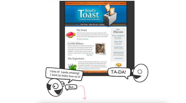
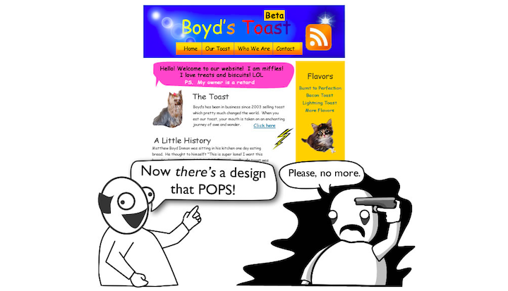
If you’re not familiar with the old Oatmeal comic called “How a Web Design Goes Straight to Hell”, read through it some time. It’ll make you laugh while simultaneously sending shivers down your spine:

While I’d love to say that your client shouldn’t be faulted if they have bad taste or don’t know what constitutes good design, it doesn’t make your job any less frustrating.
So rather than make excuses for the client, let’s talk about what you can do to get through this painful scenario in one piece:
Make Sure It’s Objectively Bad
I know they say that beauty is in the eye of the beholder, but there are just some designs that most of us would agree are downright bad.
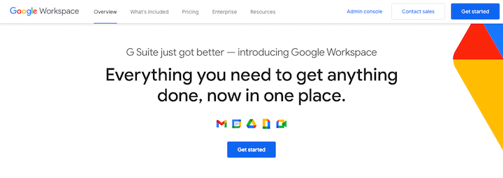
Take Google’s logo revamp in 2020:

The reviews were consistently bad everywhere you looked:
- “Google’s new logos are bad” – TechCrunch
- “Gmail’s new logo is a mess” – Fast Company
- “Google Extends Its Horrible Streak with a New Set of Icon Designs” – The Big Tech
- “Gmail Users Don’t Like the New Logo – Here’s Why” – Screen Rant
- “Google’s new logos are bad” (a discussion) – Hacker News
It might be hard to get this kind of consensus when you’re assessing a logo or website design from a relatively new or unknown company. Asking your design peers for their thoughts on it is one way to go though.
Another thing you can do is to gain some perspective on what they’ve brought you. For instance, if they have a very retro-looking logo that you’re worried is more outdated than cool, have a look at their competition.
Would their old design placed side-by-side with the others look really out of place and perhaps even amateurish?
How about if you do a search for the design style they’ve brought you? Can you find other logos or sites in that same style that actually look good?
If you have a valid reason for believing that their bad design is hurting or will hurt their brand, then go to the next step.
Have an Open Conversation About the Design
Whether the client is bringing you something that’s already been designed or a suggestion for what they want, do not under any circumstances criticize the person who created it.
For starters, you never know where the design came from. What if they did it themselves? Or their brother-in-law’s best friend handled it? Or a graphic designer they still work with?
Expressing negativity towards someone else’s work could cause issues in this client relationship, so keep it to yourself.
Instead, try to draw the doubts and dislike out of your client through a series of questions.
If they bring you something that’s already designed, ask them:
- Do you like the design?
- Are you proud to have it represent your brand?
- How long have you had it?
- Where did the idea come from?
- What do you like about it?
- What would you change if you could?
By taking them through this line of questioning, they’ll start to view it as a valuable asset and not just something that’s “okay” to use. And as they think about it more and more, there’s a good chance that they’ll come to the conclusion that they’re in need of a change.
On the other hand, if they make a design suggestion for something you’re working on, ask them:
- What inspired this idea? Have you seen it somewhere else?
- What do you like about it?
- What do you think your customers will like about it?
- How do you think this change will affect the ROI for your branding or website?
By making it feel more like a collaborative conversation, the client is more likely to see that you have their best interests at heart when asking these questions.
Present Your Client with a Strategy and Proof
This is like anything else in business. If someone shoots down an idea or strategy, it’s going to be more positively received by the other party if they can prove why it’s a bad idea and then provide an alternative plan of action.
So, let’s say you send the client onboarding form to a new client. The logo you get back is bad – like it looks like it was made in Microsoft Paint and it’s saved in a Word doc.
There are a number of ways to deal with this.
The first is to ask the client for the source design files. If they insist that the Word document is the source or they tell you they’re not in touch with the original designer anymore, then all you need to do is show them how differently a scalable vector logo and the one they’ve given you will appear on a website or social media.
Even if they drag their feet on agreeing with you, you can at least propose that the logo be reconstructed in a usable format. Then you can make some subtle tweaks to de-uglify it.
Now, let’s say the client can track down the original files. In this case, data is going to be your biggest ally.
If you have portfolio examples or case studies that demonstrate how a redesigned logo positively altered a brand’s perception or success, bring them to the discussion. Show your client the before-and-after of logos you’ve redesigned and also provide them with any data you have.
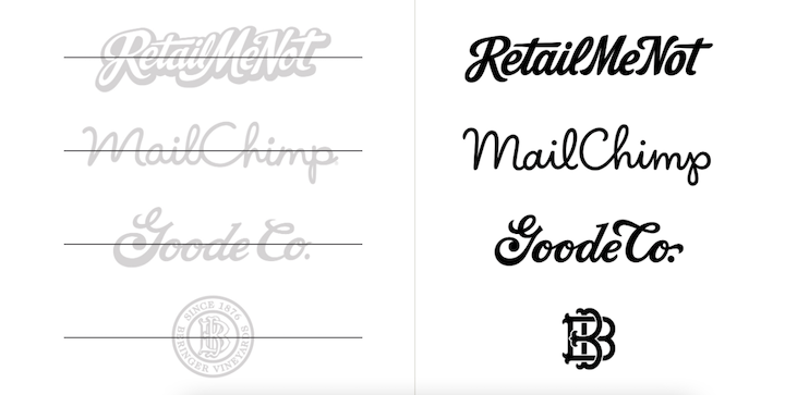
If you’re not in the habit of doing this yet, take Jessica Hische’s lead:

These side-by-side comparisons are a highly effective way of convincing clients to let go of their bad design decisions.
If you don’t yet have proof of your own, don’t worry. Just look online for case studies or news clippings that back up your argument that a redesign is needed. Then, have a rough plan ready to go for what you’d plan to do.
Choosing Your Course of Action
After you identify a genuinely bad design, talk to your client about it, and present them with a plan, it’s time to figure out what you’re going to do. Do you take on the job or pass?
It all depends on how they respond:
If the Client Agrees to the Changes…
Awesome! Then there’s nothing else to do than to implement your plan and get moving on it.
If the Client Is Hesitant…
This isn’t always a black-and-white matter.
For example, let’s say the client agrees with you. They know that what they want to use is ugly and outdated. But if all their answers end with “…but it’s going to cost too much”, then you need to be mindful of that.
Yes, good design can bring a hefty return on investment. However, not every business is in the position to make that investment right now.
So, what do you do?
You could propose a budget-friendly way of giving their existing design a facelift. You could always do away with a bad logo and replace it with a lettermark until their business is generating enough money to pay for a new one.
Another option is to just design around a bad logo or ugly image. It’s not ideal, but it’s a viable option if you like the client and want to help them out.
If the Client Disregards Your Concerns…
So, let’s say they disregard your advice. After all, they were able to design their own logo in an hour using a free tool. So, how can you even justify the time or money it will take to design a new one for them?
That argument tells you a lot about the client:
- They don’t respect the work you do.
- They don’t see the value in professional branding or marketing.
- They’re going to get very combative any time you don’t do what they ask you to do.
Ideally, these are the kinds of things you’re able to determine about a client before you sign a contract. But it doesn’t always happen that way.
So, you need to figure out what you want to do.
It’s their business that’s at stake, right? So, should you even care if they want you to design an ugly-as-heck website or to use a logo that looks like it was designed by a first-grader?

If you’re just starting out as a designer or if your business has been slow lately, you might really need the money. If there’s no risk in them killing your profits with scope creep or stiffing you on the bill, go ahead and get the job done as quickly as possible. You won’t be able to use it in your portfolio, but you can consider it a lesson learned.
For those of you who just don’t want to do it, don’t.
There’s no need to get personal or accusatory at this stage. Draft up an email (make sure it’s in writing) and explain that it wouldn’t be fair to them if you continued working on the job as you can’t execute their vision. Make it be about you and not them or their bad design taste.
Also, check your contract and find out what the terms are to cancel. If there’s a kill fee (i.e. you get paid for all the work completed), make sure to include it in your cancellation letter.
And as a gesture of good will, refer them to other designers or sources where they can find a different designer. I usually point them to Toptal or Upwork, in that case.
Final Thoughts
As I mentioned in the last section, the ideal situation is to work with clients that trust you and your design instincts. As well as ones who have the budget to pay for the services they need.
But, on occasion, these tough clients will slip through the cracks.
If you want to reduce the time they take from you and stress they cause you, there are a couple things to do.
The first is to build a stronger vetting process. Have them fill out a prospect questionnaire that asks them to share their logo with you or to share examples of websites they want theirs to look like.
Also, get them on the phone before you sign any paperwork. You can tell a lot about how someone will be as a client if you speak to them one-on-one.
Another thing to do is to account for this type of situation in your freelancer contract. A kill fee is a must as well as clear cancellation rules and terms.
The more you can weed out these troublesome clients before they actually become clients, the better it’ll be for everyone involved.


