The Different Logical Ways to Group CSS Properties
Here’s a bit of CSS:
.module {
  background: rgba(198, 148, 72, 0.75);
  color: #222;
  clear: both;
  margin: 0 0 2rem 0;
  position: relative;
  overflow: hidden;
  display: flex;
  flex-direction: column;
  border: 2px solid black;
  border-radius: 4px;
  padding: 1rem;
  font-family: sans-serif;
  font-size: 0.9rem;
  line-height: 1.4;
  opacity: 1;
  transform: opacity 0.2s ease-in-out;
  transform-origin: right center;
}
That looks a lot like CSS I write. I’ll admit, I traditionally haven’t had much of an opinion about the ordering of CSS properties. I just add what I need. I think they end up largely “grouped” by related things, because that’s just how my brain spits them out.
Even though I don’t particularly mind this “random” (no real logic applied) arrangement, I can see arguments against it. If there was a duplicate declaration, it would be hard to spot, and might make for some mind-melding troubleshooting. It’s happened to me plenty of times, now that I’m thinking about it.
I also admit I do have some style guide preferences, like 2-spaces, spaces before the opening brace, one space after colons, and things like that. That’s another article.
Let’s take a look at some ways we could apply different logic to this ruleset.
Alphabetically
Let’s rearrange them all alphabetically:
.module {
  background: rgba(198, 148, 72, 0.75);
  border: 2px solid black;
  border-radius: 4px;
  clear: both;
  color: #222;
  display: flex;
  flex-direction: column;
  font-family: sans-serif;
  font-size: 0.9rem;
  line-height: 1.4;
  margin: 0 0 2rem 0;
  opacity: 1;
  overflow: hidden;
  padding: 1rem;
  position: relative;
  transform: opacity 0.2s ease-in-out;
  transform-origin: right center;
}
Now there is a little logic applied here. If you are specifically looking to see if this declaration has an opacity property name, you can scan through it to find where “o” is alphabetically in the list and, ideally, find it very quickly. You’ll have to trust that the alphabetical format is adhered to perfectly, but I can see the appeal.
Jerry Low is a big advocate:
“The alphabet has a universally understood order. Most of us can probably order things alphabetically without overloading our brains… The speed and non-ambiguous ordering is a strong enough argument for alphabetizing your CSS properties, but to me, the biggest advantage is in collaboration — the lack of learning curve.”
You also get some natural grouping happening here. Notice the font properties are together and the transform properties are together, just by virtue of their naming. In a happy accident, the flexbox stuff is next to each other as well, but slip a filter or fill property in there and they wouldn’t be. Some things you might expect to be next to each other, like margin and padding are not. Which leads us to…
Grouped by Type
As we saw “type” grouping happens naturally, a little, when you go alphabetical. But there are lots of exceptions, as so it might make sense to group properties by what they do instead of what they are called. I said “type” in quotes, because how we group properties into types is entirely up to us, it’s not a semantic or programatic concept.
With some blank lines to help separate types, maybe we end up like this:
.module {
  background: rgba(198, 148, 72, 0.75);
  color: #222;
  opacity: 1;

  border: 2px solid black;
  border-radius: 4px;

  font-family: sans-serif;
  font-size: 0.9rem;
  line-height: 1.4;

  position: relative;
  display: flex;
  flex-direction: column;
  clear: both;
  overflow: hidden;

  margin: 0 0 2rem 0;
  padding: 1rem;

  transform: opacity 0.2s ease-in-out;
  transform-origin: right center;
}
Then that begs the questions: How do you order the groups of types? What goes in what type? How do you order the properties within each type? Those questions don’t necessarily need answers, they’re just food for thought.
Michael Arestad, who doesn’t care much how you order properties, says:
“Usually people get positioning, box model, and typography properties grouped nicely even without training.”
But he does make clear that this “readability” stuff isn’t all that good of an argument:
“Ease of reading is a straw man argument by me. It’s easy to knock down because all that matters is the easy of finding a property. This is just as easy with either method and more often than not, in my experience, starts in the browser.”
By Line Length
Wanna get weird? More people that you might think do this:
.module {
  background: rgba(198, 148, 72, 0.75);
  transform: opacity 0.2s ease-in-out;
  transform-origin: right center;
  border: 2px solid black;
  font-family: sans-serif;
  flex-direction: column;
  margin: 0 0 2rem 0;
  position: relative;
  border-radius: 4px;
  font-size: 0.9rem;
  overflow: hidden;
  line-height: 1.4;
  display: flex;
  padding: 1rem;
  color: #222;
  clear: both;
  opacity: 1;
}
I don’t mean to be rude calling someone else’s coding style weird, but to me this seems to be an expression of being compulsive about something just for the sake of it. There are no advantages that I can see, other than it looks kinda neat. Plenty of disadvantages though, like changing a value may require you to reorder it.
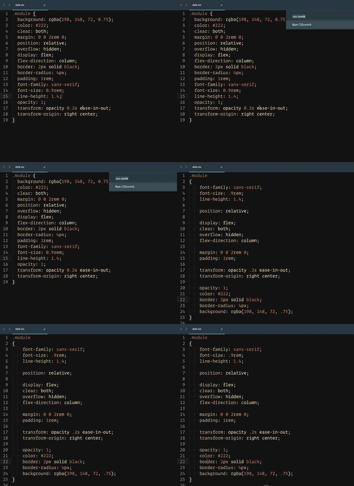
CSS Comb
It’s worth mentioning CSS Comb, which is a project that organizes your CSS properties as it’s default out-of-box purpose.
It’s also extremely configurable. They have a 24-step configuration tool to get things just how you like them. I gotta say: this appeals to me. In fact I just created my own new config and plan to start using this. It seems especially nice in a team environment. This way you get the benefit of a logical ordering (if there is one!), plus a consistent and enforced code style, for nearly zero effort.
There is a PostCSS plugin as well. But remember it doesn’t matter how your processed CSS file ends up, we’re talking about processing our authored stylesheets here, so it probably makes the most sense as an in-IDE thing (which this plugin offers).
Others
Do you know of any more ways to organize your properties? How about “last added, by date”? In order of how much you like the property?! How important you deem the property to be??!!


