Building an Animated Web Project Using a JavaScript Timeline
For the month of April, Media Temple was offered ad banner space on CodePen.io, an online community for sharing and exchanging front-end code snippets. It was an exciting opportunity for Media Temple to boost its brand presence in the developer community and a chance for me to experiment with CSS and JavaScript-driven motion graphics, on a platform visited by thousands daily.
In creating the ad, we had a few technical and conceptual constraints. It had to be:
- Fluid. It must look great at 275 x 275, and scale down to 125 x 125.
- Lightweight. It’s an ad, not the content that’s driving users to the site. It shouldn’t take too much time to load, bandwidth (especially on mobile), or browser resources.
- Rad. Media Temple wanted to leave a good impression, so this couldn’t be a typical GIF banner. If this was going to compete for attention on a site that showcases some really great dev and design work, it needed to look good and be built in such a way that CodePen’s audience would want see under the hood.
The resulting ad is a lightweight animated banner built with only HTML, CSS (I used LESS), and JavaScript, framed by developer-friendly messaging.
Check out the ad on CodePen.
In this quick case study, I’ll walk through the thinking behind some of the decisions I made, from storyboard to launch. At the end, I include links to the code of the entire project as well as a bare-bones version of my animation framework that you can use as a starting point in your own web animations, both on CodePen.
Concept

Instead of advertising a single product or service, we wanted to make a positive statement about our brand in a clever way that would resonate with the site’s audience. We started with messaging that informed the ad’s narrative content and offered a nod to the history of web development: “From table layouts to media queries, Media Temple has offered state of the art hosting to developers since 1998.” To bring the message to life, we considered ideas like an arcade-style game or an interactive timeline. In the end we decided on an animated banner showcasing how web design has evolved since Media Temple’s founding in 1998.
Design

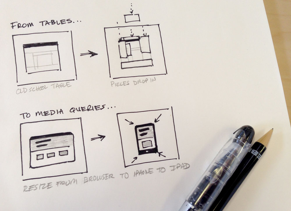
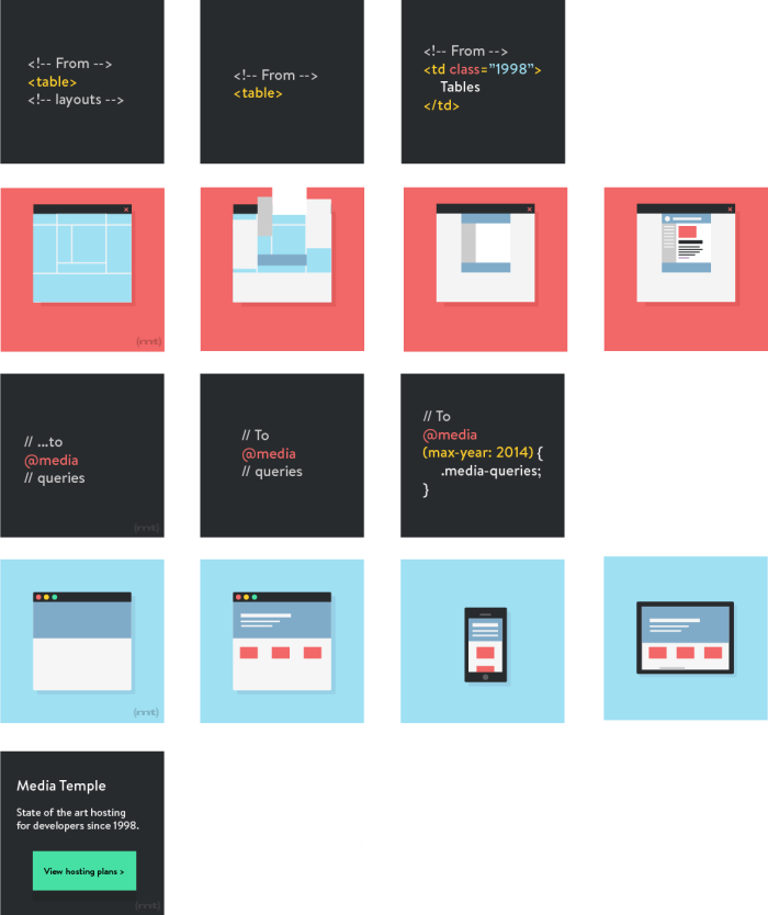
I started the design process by storyboarding the ad. To keep things simple, I broke it down into two main animated scenes, separated by text interstitials and capped with a call to action. The first scene would depict the construction of a 1998 table-based website layout, complete with image slices literally dropping into place. The second scene would depict modern-day responsive web design: a Mac-style browser window that transforms into a iPhone-style mobile device and again into an iPad-style tablet. I knew from the start that the aesthetic would be flat and colorful, utilizing our new brand colors and making it easier to animate its components.
HTML elements vs. SVG vs. PNG
Deciding how I would render the graphics dictated how I would animate the graphics. Since the ad had to be fluid, I chose not use use PNGs. While they’re completely lossless at a fixed size, even Retina-friendly @2x PNGs start to lose their crispness once they’re resized in-browser to sizes at which they weren’t optimized. I have some experience animating SVGs, but to make the process easy it requires an external JavaScript library like raphael.js or snap.svg (which I highly recommend). Unfortunately, an external library would make the ad less lightweight. In the end I opted for using native HTML elements, and manipulating them with CSS tools like transitions, transforms, and keyframe animations.
Animation timeline
The biggest planning challenge was determining a JavaScript method by which I would actually time, synchronize, and launch the animations. In my research, I initially focused on tweening engines like tween.js and three.js. But again, these external libraries would make the ad less lightweight, and they came with a learning curve. As I only had four days of actual coding to put this together, I decided to go with straight JavaScript with jQuery.
The JavaScript timeline I envisioned had to be very simple. I didn’t want to rely on Inception-style setTimeout functions or a bunch of animation-triggering functions that – once strung together in the dozens – could quickly become difficult to organize. I wanted to create a very basic list of instructions: after one second, do this action to this element; after another second, do another action to another element.
Luckily, in my research I found a simple solution that I could easily adapt. First, I created an array in which each group includes the amount of time to wait, an HTML selector, and a class name to apply to the selector after the time has lapsed. For example, after one second, add class action-1 to .selector-1; after another second, add action-2 to .selector-2.
I used another function to build the timeline by looping through the array I mentioned to create a stack of setTimeout functions. A setTimeout function executes another function after a set amount of time. In this case, each setTimeout function executes a function to add a class to its paired selector, which we mapped in the array. Finally, a trigger function executed all these setTimeout functions in order.
// This is the main animation timeline array

var animations = [
    {
        // Activate the first animation after 2 seconds
        // by adding class "action-1" to CSS selector
        time:2000,
        step:"action-1",
        selector:'.selector'
    },
    {
        // Activate the second animation 1 second later
        time:1000,
        step:"step-3",
        selector:'.selector'
    },
    {
        // Activate another animation on another selector
        // after another 2 seconds
        time:2000,
        step:"step-4",
        selector:'#other-selector'
    },
    {
        time:3500,
        step:"step-5",
        selector:'.selector .detail'
    }
];

// Grab data from the animation array and create
// sets of selector and classes to add after defined setTimeouts

function runAnimation(i, timeline){
    setTimeout(function(){
        $(animations[i].selector).addClass(animations[i].step);
    }, timeline);
}

// Go through the array, and execute each step one at a time in order
// by doing runAnimation() on each array element

function animationTimeline(){
    var timeline = 0;

    for(var i=0; i<animations.length; i++){
        // For each step in the animation array update timeline
        // to be value of animations[i].time PLUS previous value
        timeline = parseInt(animations[i].time, 10) + parseInt(timeline, 10);
        runAnimation(i, timeline);
    }
}
Putting it all together
With all the pieces planned out, I assembled the animation chronologically action by action. I used percentages for all widths, heights, and positioning. I even wrote a function to dynamically convert font-size into a percent of the ad’s height.
The entire animation was wrapped in a .container class with overflow:hidden applied. The backbone of the animation was the application of .slide- classes to .container with the JavaScript timeline. The interstitial text and animated browser scenes and their child elements were moved, hidden, and stretched via the specific .slide- class applied to the parent .container. LESS made writing this sometimes complicated object-oriented CSS a breeze.
/*  I use the "slide-" classes to move scenes into position. */

.container.slide-1 {

    /* Positioning relevant to the first text scene
       .text-1 is the container for the first text scene,
       .motion-1 is the first browser scene, etc. */

    .text-1 { top:0; left:0; }
    .motion-1 { top:0; left:0; }
    .text-2 { top:0; left:100%; }
    .motion-2 { top:0; left:200%; }
    .text-3 { top:0; left:300%; }
}

.container.slide-2 {

    /* Positioning relevant to the browser scene
       featuring the old-school table layout. */

    .text-1 { top:100%; }
    .motion-1 { left:0; }
    .text-2 { top:0; left:100%; }
    .motion-2 { left:100%; }
    .text-3 { left:200%; }
}

.container.slide-3 {
    /* Second text scene positioning */
}

.container.slide-4 {
    /* Responsive browser positioning */
}

.container.slide-5 {
    /* Final text call to action */
}

/* Further down the stylesheet, I manipulate elements
   based on what scene we're in */

.slide-2 {
    .browser {
        /* The .browser element style in the second scene */
    }
}

/* Sometimes I used the JS timeline to add styles
   directly to child elements */

.tablet.js-active {
    /* Styles for the responsive tablet scene */
}
In order to focus on or debug specific scenes, I commented-out unnecessary steps in my animation array as well as the corresponding elements from my HTML doc. All in all it wasn’t as confusing or meticulous as I had thought it would be. The most frustrating bugs I encountered involved making sure that the styles I applied to objects with my keyframe animations were persistent, but the handy animation-fill-mode: forward CSS style fixed that. Ironically, I wound up using actual tables on both the 1998 and modern-day scenes, as it was the easiest way to maintain a tight, percentage-based layout at every size.
The project was a success. It looks great on the CodePen site, and it has attracted attention for the brand through Twitter and the code explanation I posted to CodePen. I had a lot of fun conceiving and executing the project and it was really great to get feedback from Chris Coyier, who’s kind of an industry legend. You can see how I put together the ad here. You can also find a timeline framework for use in your own project here.


