Sustainable Web Design: 4 Easy Ways to Contribute to a Greener Planet
How many of you are conscientious about recycling? Or about walking or biking instead of driving somewhere close by? Or about turning off lights in your house when you’re not using them?
There are tons of ways in which we contribute to environmental sustainability as consumers. But what about as professionals?
It’s been almost a decade since I stepped foot inside an office, but I do remember there being recycling initiatives and energy efficiency measures in place wherever I worked.
As freelancers, agencies, and business owners, do we think about these things? More importantly – and what I want to focus on today – is do we think about how our work in the web design space impacts sustainability?
As people around the globe are spending record amounts of time online, this is something we need to take more seriously. Below, I’m going to provide some practical tips that can help designers build a greener web.
1. Build More Efficient User Journeys
As consumers use more devices and spend more time online, our global energy consumption and CO2 emissions are on the rise. In fact, according to a 2019 report from The Shift Project, digital technologies are responsible for 3.7% of all greenhouse gas emissions (and likely higher now because of the pandemic).
While you can’t go up to people and demand that they spend less time on the internet, you can design more efficient websites that encourage a shift in behavior.
One way to do this is to design single-page websites. You can do this for websites that have a decent amount of information to share, too.
Here’s an example from Highwave:
There’s no real navigation for the site. Just a trail of breadcrumbs at the bottom that lets prospective customers know what kind of information comes next and how much more scrolling there is before the end.
Because a single-page website can only hold so much information, it forces both you and your clients to really think about what the most important information is and how to quickly and effectively communicate it before visitors burn out on scrolling.
If a single-page website is too restrictive for what you need to do, that’s okay. Designing shorter pathways works just as well, too.
For instance, this is the website for Mightybytes:
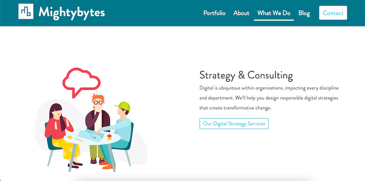
The main navigation tells a visitor a lot about what they should be spending their time on on this website. Mightybytes doesn’t bog visitors down with links to pages for individual services or information on careers or company press releases. This is all secondary to the primary journey and can be found outside the main navigation.
By including only the most important and valuable pages in the navigation, you can help visitors be more efficient with the time they spend on your site (and on the web as a whole).
2. Optimize Your Website’s Performance
The most important reason to optimize your website’s performance is to improve the user experience. If your site can’t load in under three seconds, not only will you test the patience of many of your visitors, you’ll start losing them in droves with each passing second.
SEO is another reason to be mindful of website performance, as evidenced by Google’s Core Web Vitals algorithm update.
And, yet, another reason is sustainability.
Obviously, when you speed up a website, you make it much easier for visitors to get the information they need and complete whatever goals they have (like reading a blog post or buying a product). So, speediness is a plus — and having a web host that prioritizes performance will help with this.
That’s not all that performance optimization can do. It can also lead to fewer HTTP requests.
Take the McDonald’s website, for example. Core Web Vitals gives it a sub-par performance score:
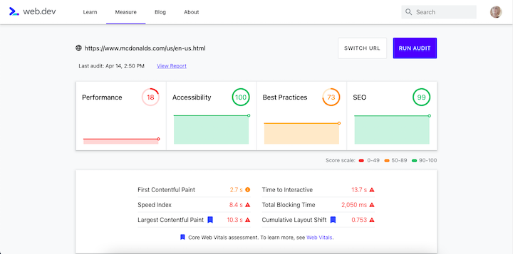
When you look at the list of performance suggestions, you’ll see that there are two main contributing factors:
- Too many unused or resource-heavy elements
- Oversized images
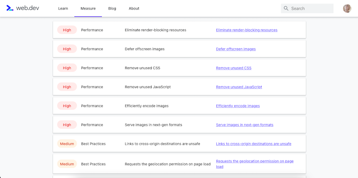
Unless you use sprites, you can’t actually reduce the number of images your web server has to process unless you design the set with fewer graphics.
But you can reduce all of the other file requests your server has to deal with through:
- Caching
- Minification
- Gzip compression
- Combining code
In addition to creating faster websites which helps visitors get in and out more quickly, optimized sites require less work from servers, which is also good for the environment.
3. Help Businesses and Consumers Save Time and Reduce Waste
There are so many ways in which we’re dirtying up the planet. As a web designer, you can empower your clients’ businesses as well as their users to make greener choices.
All this ultimately depends on who you’re building a website for.
Let’s use the example of a life coach, like Yvonne Victor. Yvonne has this booking calendar on her site:

How in the heck does this help the environment? Well, think about the last time you tried to schedule a meeting with a prospect or client. How many back-and-forth emails did it take to coordinate the details, set up the virtual meeting space, and so on?
This form empowers prospects to sign up for a discovery call right now. They pick the date and time, as well as provide details about what they hope to achieve during the call.
Digitizing processes for time savings isn’t the only thing you can do. Take real estate and rental companies. These business models revolve around their ability to “show” properties to prospective buyers or renters.
What sort of unsustainability is involved in this process?
For starters, the prospect traveling to and from the property for the tour adds to the emissions problem. There’s probably going to be some paperwork to fill out on site, which can create undue waste. And, in the time of COVID-19, all the additional cleaning supplies (unless they’re explicitly eco-friendly) could be problematic as could any PPE that isn’t properly disposed of.
That’s not to say that there isn’t value in having prospects tour a property in person. However, a website offering the option to do a virtual 3D tour instead could help offset the carbon footprint.
Many apartment communities, like Manor Riverwalk, now offer this option:
Every business is different, so you’ll want to assess what they currently do and then see if you can build a more sustainable option or process into the website.
4. Improve Customer Satisfaction to Decrease Environmental Waste
The process of returns and refunds is a costly one – both for in-person transactions as well as online. Though ecommerce returns are much more costly and damaging.
The Guardian sums up this problem with the help of data from Optoro:
“Each year Americans return about 3.5 billion products, and five billion pounds of returned goods ended up in US landfills, according to Optoro, a technology company that helps retailers process returns.”
So, other than make shipping and returns fees so high that customers decide it’s better to return the item in person or to swallow the costs, what do you do?
Improve customer satisfaction.
One of the reasons why there are so many online returns is because customers are going off the information they’re given.
Obviously, businesses are going to paint their products in the most glowing of terms and with the most flattering of images. There’s nothing wrong with that … but it can create issues with customer satisfaction if the color shows up looking different from the photos, if the fit is all wrong, or if the piece of furniture is impossible to set up.
Thankfully, we have plenty of technologies now that can remove the doubt and lack of transparency from these online transactions.
Providing customer reviews on the site – and showing that they’re verified – is extremely helpful. Purple does this:
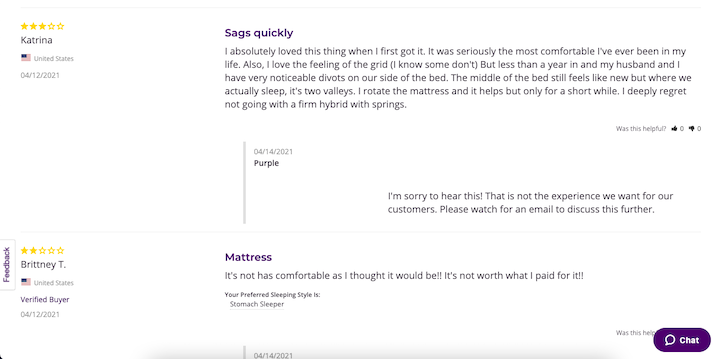
Even if the review isn’t the most positive, it can help customers weigh the pros and cons based on the real experiences that existing customers have had with the product.
User-generated content is another way of letting customers offer proof of what it’s like to use a company’s products. This is something that Sephora does and it’s a really great way to help people buy products that would be otherwise really risky to try and pick out from home:

Augmented reality is another useful tool to improve customer confidence and satisfaction with a purchase. But the technology can be expensive to implement for smaller retailers, so it’s not always a viable option.
Wrap-Up
I’ve heard people talk about “digital sobriety” as a solution to the environmental sustainability problem. But let’s be honest, that’s never going to happen.
Instead, we should focus on digital dieting.
In other words, what can you do as a web designer to make a website faster and easier to get through while removing the excess and waste that’s often involved in business-to-consumer transactions? Above are 4 sustainable web design ideas to start with.


