Remove Distractions and Waste from Your Website
In 2019, U.S. adults spent an average of 6 hours and 49 minutes online every day, according to data from eMarketer. But then 2020 rolled around and the average time shot up to 7 hours and 50 minutes.
While the internet certainly makes our lives easier in many ways, this increased screen time (as well as the circumstances surrounding it) is causing issues for a lot of people.
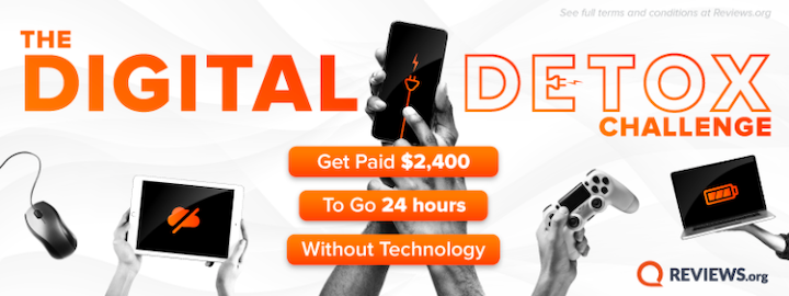
That’s why it’s no surprise to see a rise in digital detox apps like distraction blockers and smartphone features like screen time limits. And with Reviews.org’s recent announcement of a 24-hour Digital Detox Challenge and $2,400 cash prize, I expect we’ll see more of these challenges, too.
So, let’s say that this increased awareness around digital wellness and digital detox actually gets people to spend less time online. What does that mean for you and the websites you build?
It means you’ll need to be more mindful of what you design. The last thing you want is for your clients’ sites to be blocked by apps or abandoned by visitors for being too distracting, addictive, or otherwise harmful.
So, you’ll need to focus on designing digital experiences that are fast and friction-free.
How to Design “Healthier” Websites for Consumers
Here are some things you can do to keep manipulation, distraction, and waste out of your websites and to help consumers quickly and painlessly get what they need:
1. Design Mobile-First UIs
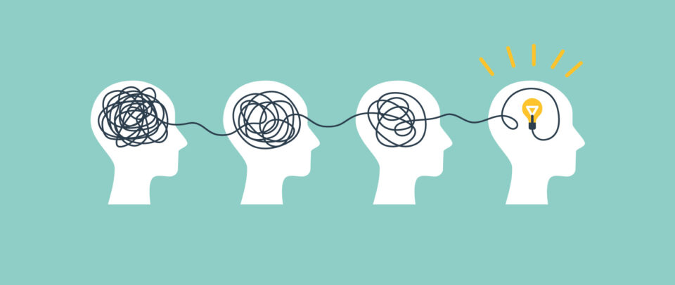
One of the reasons people might spend a long time on a web page or website is because of the sheer length of the content they have to get through.
As a writer, I can tell you that there are always ways to remove the “fat” from a page, even if you believe that every bit of text and every image is necessary. I realize it can be hard to part with the content it took you so long to create or lay out, but trust me, your visitors will be much happier with the excess gone.
One reason I know this is because of the way people’s eyes naturally scan a page. NNG has done tons of research on this over the years and not a whole lot has changed.
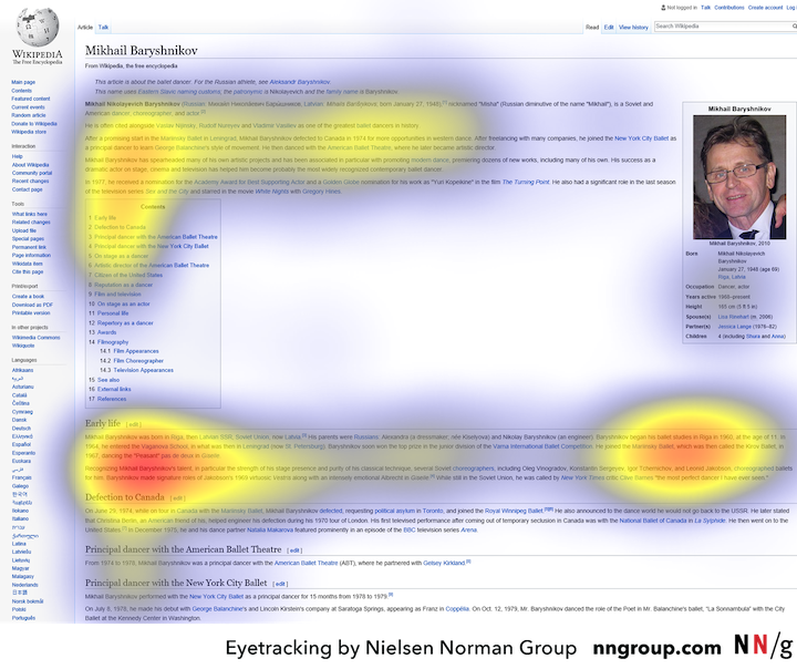
Most of today’s common eye-tracking patterns are similar to the F-pattern. Users focus heavily on the content at the very top of the page, occasionally pause to take in an eye-catching header or image, and then lightly scan the left margin the rest of the way down.
It’s a very efficient way of getting the gist of a page, and it’s something we all do as internet users.
So, how exactly do you know what the ideal length of a page is or what to remove from an existing one?
Design your websites for smartphone users first.
Because of the smaller real estate available, you’re forced to design minimal, clutter-free interfaces and to ensure that the most important information is as close to the top as possible. When you start designing for mobile, you automatically take a more efficient design approach.
2. Get Rid of Stress-Inducing Alerts and Distractions
You have a new email, matched with someone on your dating app, got tagged on Slack, or maybe it’s a text from your UberEats driver letting you know that your food arrived. Alerts are everywhere and we’re used to diverting our attention to them the second they arrive.
Unfortunately, with the growing amount of negative and stressful events happening around the world, every new message has the ability to trigger an instantaneous and panicked reaction.
Mental health professionals like clinical psychologist Maria Mouratidis explain how this happens:
“Having devices literally in our hands all of the time keeps us in a state of alertness that can be draining over time. The amount and type of information is not often filtered for urgency or importance.”
Dr. Yamalis Diaz elaborates on the role that notifications, in particular, play in this:
“[Our threat-response system] doesn’t bother shutting off if we are constantly receiving notifications or reading and watching the news, with pings, and dings, and emails. We can have a stress reaction to that notification or information and on a physiological level, it can all activate our stress system throughout the day.”
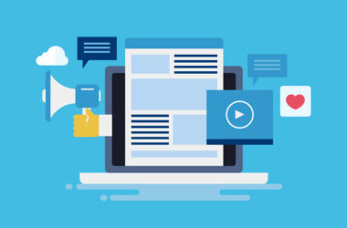
Web designers have included alert-like elements and other distractors in websites for years now because they know how effectively they grab people’s attention. But now that we know what we know about the stressful responses they induce, it’s time to stop using them.
This includes anything that acts like or resembles an alert or otherwise uses motion or sound to distract the visitor from the main content on the page. For example:
- Pop-ups
- Chat widgets that open without user interaction (and, worse, play a noise)
- Autoplaying videos or ads
- Countdown timers
- Blinking elements
- Horizontal-scrolling bars
- Anything that looks like a message is waiting in the inbox (when the user isn’t logged in)
On the Conde Nast Traveler website, for instance, we see three of these distractions:
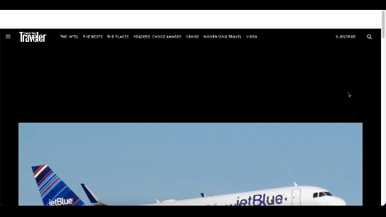
The first is a pop-up and it appears immediately. The next two are ads – one is an auto-playing video promo, the other is an animated banner – that appear when the readers reaches the content. They stay in view until the visitor gets to the end.
All these alerts do is distract people from the main offering. They’re either going to have to spend longer on the site than they wanted or get frustrated by the distractions and leave. Neither is an ideal outcome.
3. Make Sure Every Goal Can Be Reached Within 3 Clicks
Every visitor comes to a website with a goal or two in mind. For instance, someone looking for a web designer might go to your site and look for:
- Samples of your work (Portfolio)
- Information on your background (About)
- A contact form (Contact)
It depends on what stage in the process they are. Those researching their options would most likely go for your portfolio whereas those who are ready to take the leap would be more interested in contacting you.
Ideally, all three of these elements would be located in your navigation and the most pertinent information or features would be at the top of each page.
However, for larger sites, it’s not always feasible to have your visitors’ main goals front-and-center in the navigation. That’s okay so long as you keep them within arm’s reach (i.e. within three clicks from their point of entry).
A website that does this really well is L.L.Bean:
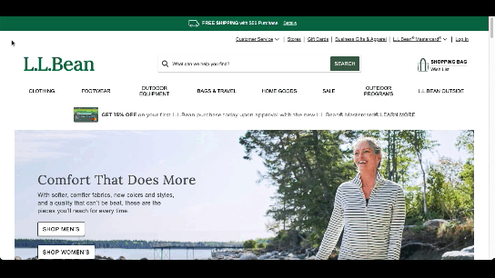
With ecommerce sites, in particular, this can be tricky because of the sheer amount of inventory available. However, if you look at the example above, visitors have everything they need above-the-fold:
- A well-organized and concise navigation
- A search bar to cut the line and go straight to what they want
- Customer service options if they need personalized help
The reason I included customer service in this example is because this is too often something that gets buried on a site despite it being an important part of most companies’ operations. A lot of times, it’s down in the footer, which can take a while to reach if the page is long or near-impossible to reach when there’s an infinite scroll.
In some cases, the customer service options or info live on an internal page, but it’s up to the visitor to guess which one. Is it on the Contact page? Nope. Hmm… Okay, maybe the About page? Still no. Alright, I guess I’ll try the Knowledgebase then. Argh.
California has recently banned dark patterns, so frustratingly never-ending mazes like these and other time-consuming and deceptive dark patterns have no place in design.
Bottom line: Your websites need to be equipped with efficient and logical user journeys. As consumers look to digitally detox, websites that allow them to get in and out with ease are going to create much happier and devoted fans than those that waste their time and test their patience.
Wrap-Up
Too much time online can increase depression, hamper productivity, and increase fatigue. That said, even if we don’t see internet usage rates significantly drop as a result of this, you should be thinking about what kind of digital world you want to contribute to.
Do you want it to be one that’s bloated and gluttonous and ultimately leaves consumers feeling drained and unhappy with the choices they’ve made?
Or do you want it to be one that helps them get what they need, and does so in a memorably convenient and pressure-free way?
If it’s the latter, it’s time to start incorporating the three ethical design techniques into your strategy.