Creative Ways to Choose More Inclusive Imagery for Websites
Let’s be honest: People probably aren’t going to stop to read every word on the websites you create. With so much to do and see and buy online these days, it’s only natural for people to skim through web pages.
Images are another story. Do a good job in picking a few eye-catching and descriptive images, and you can effectively tell a brand’s story in a matter of seconds.
That said, you have to be really careful with imagery. It’s not enough to pick photos that encapsulate the idea you’re going for. If your images tell the wrong story about the people behind the brand, the people they serve, or the people they want to work for them, it could be a huge problem.
So, what I’d like to look at today is how to choose more inclusive imagery for a website.
Now, this isn’t going to be your standard post about stock photo sites you can use to get more diverse images. While those posts are certainly useful, they don’t address the bigger issue of inclusivity – which is something that goes beyond just the demographics of the people in your pics.
Let me show you:
Tips to Help You Choose More Inclusive Imagery for Websites
If you want to create an inclusive website, here are some things you can do when choosing imagery for it:
1. If the client isn’t excited about what they see in a stock photo, don’t use it.
Stock photography is an easy go-to for web designers since many clients won’t have custom photos you can use. There’s nothing wrong with using stock photos. Some stock photos, anyway.
This is one of my favorite parody videos:
It’s Emilia Clarke (yep, from Game of Thrones) trying her hand at stock photo modeling. It’s ridiculous and wonderful, but at the same time, it makes me cringe because I’ve seen these same kinds of images used on the web time and time again.
While I think it’s fine to use stock photos when you have nothing else to work with, you need to make sure they resonate with your client. If they don’t feel honest or realistic to them, it’s going to come off just as phony or cheesy to their visitors.
So, closely gauge their response and make sure they’re excited about the images and the people within them that will represent their brand online.
2. Be careful about retouching photos.
Brand authenticity is really important for today’s consumers.
That doesn’t mean photos need to be filled with pimples and cellulite and beer guts (if it doesn’t fit the brand identity, that is). But it does mean being cautious when it comes to using overly manipulated imagery – and, perhaps, avoiding it altogether.
Did you know that a few years ago France enacted a law that required companies to disclose when they digitally altered a photo?
Health Minister Marisol Touraine explained its purpose:
“Exposing young people to normative and unrealistic images of bodies leads to a sense of self-depreciation and poor self-esteem that can impact health-related behaviour.”
And according to Dr. Rachel O’Neill:
“Over time, it’s possible for an individual to internalize these feelings, which may result in low self-esteem, reduced self-confidence, and feelings of sadness and depression.”
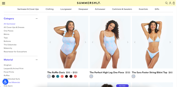
This is why untouched photos should be part of an inclusive design strategy. Summersalt, for instance, has a website that feels totally genuine because of this:

From its swimwear photos to its Instagram user-generated content feed, untouched photos abound!
By allowing the model’s idiosyncrasies to shine through, more people can actually see themselves in the product. And that’s the first step that enables brands to form positive connections with their users.
3. Think about what the photo’s setting suggests about the brand or its customers.
When we talk about inclusivity in imagery, the focus is usually on the people. But there are other parts of your photos that can make a brand feel exclusive and not in a good way. Let me give you an example.
I’m moving from Rhode Island to Florida next month. At the top of my list of criteria for an apartment is dog-friendliness. I’m a crazy dog-mom and want my pups to live in a place that’s just as safe and pleasant for them as it is for me.

Usually, I use Google and apartment listing sites to narrow down my search. But just because a website has the word “dog-friendly” or “pet-friendly” on it, that’s not enough for me. I’ve lived in enough places to know that properties that don’t show how dog-friendly they are really aren’t.
Camden Westchase Park was one of the properties I was considering because of how well it demonstrated its dog-friendly vibe:

There are other ways to look at photos through this lens.
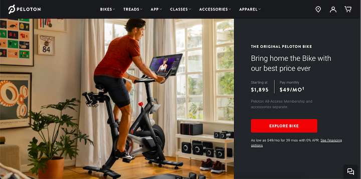
Take Peloton, for example. While the bike is always the focus of the photo, the person’s surroundings tell a very specific story about the people who use these bikes:

From the giant windows to the fancy home gym setup, it’s clear that Peloton isn’t the right home workout solution for certain people – like college students, people living in tiny studios in NYC, etc.
So, you should really think about what the setting of your photos – from the environment to the products within it – do in terms of including or excluding some people. In the case of Peloton, it’s the right choice since the bike is pricey and shouldn’t be marketed to people who can’t afford it.
4. Consider keeping people out of the imagery for brands that serve everyone.
There are so many ways in which we differ from others in terms of age, gender, religion, socioeconomic status, sexuality, race, location, impairment, and so on. Heck, even the devices we use and the color of the bubbles that appear in our texting apps set us apart.
Because of the vast range of differences in each of us, it would be impossible to try to account for all of them on a website and for a brand that aims to serve everyone.
So, rather than try to check off as many boxes as possible across your photos, it might just be best to take people out of the equation altogether.
Look at Apple:
The only time you see people on the website is when their faces are displayed on an Apple device’s screen. You don’t see anyone’s hands typing away on a keyboard or swiping on a smartphone. There’s barely any trace of Apple users on the website.
That’s the right call.
If Apple wants to create truly universally friendly products, it can’t use imagery that suggests any kind of exclusivity. And like I said before, it’s not just the people in the photos that can make a brand or product feel exclusive. The settings can also make suggestions about the people behind the brand or the ones who are going to engage with it.
Wrap-Up
For a time there, the issue of inclusivity in imagery had a lot to do with the white-washing of stock imagery. But we have plenty of photographers creating diverse imagery these days, so that’s definitely less of a problem than it was a few years back.
Today, there are other things to focus on when choosing imagery for a site. From avoiding retouched photos to examining the nitty-gritty of your photo’s setting, there’s a lot to think about when it comes to creating an inclusive digital space for your clients.


