4 Tips for Making Data Visualizations Look Good on Mobile
I’m a big fan of data. I think that, second to maybe only social proof, it’s one of the most powerful weapons a brand has in convincing prospective users or customers to trust it.
That said, data isn’t always the easiest to read or comprehend when all you have to look at is a bunch of numbers or steps. Or when it’s buried in mountains of text. This is why data visualization is so valuable.
Data visualization is the process of turning information into a graphic. There are many ways to represent data visually:
- Charts and graphs
- Maps
- Timelines
- Flow charts
- Infographics
- Word clouds
- Timetables
- Venn diagrams
- And more
Our brains can more quickly and effectively understand data in a visual format. In fact, studies show that visuals are processed 60,000 times faster than text. As you can imagine, this makes data visualization a critical component of a website with tons of complex information on it.
In the following post, we’re going to explore 4 things you can do to improve how you use and design data visualizations for the mobile experience.
Design Tips for Mobile Data Visualization
Here’s the thing: Much like a design that doesn’t look great, content that’s too hard to read, or features that don’t work, poorly-designed data visualizations on mobile can compromise the integrity of the brand.
Now, I don’t think that data visualization design in and of itself is the problem. Designers have come up with some amazing things.
No, the problem we have today is that many data visualizations aren’t designed with the mobile experience in mind. When that happens, only a segment of your audience can really enjoy the data you’re presenting, while the rest are left frustrated because they’re missing an important piece of the puzzle.
Based on what we know about designing high-quality mobile web experiences, I’ve put together 4 tips and examples of how you can improve your data visualizations for smartphone and tablet users:
1 – Use Familiar Data Visualization Formats
There’s a UX principle called Jakob’s Law that says that consumers expect your website to behave similarly to the sites they spend the most time on. When you deviate from these intuitive designs, it can cause undue friction in the user experience.
Let’s use the example of a map.
According to Statista, Google Maps is the most popular mapping and navigation mobile app by a long shot. Knowing this, it would probably be an unwise decision to add a mapping feature to a website that deviates too far from what mobile users are used to with Google Maps.
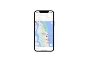
Look at how Google Maps handles a request for “dog friendly hotels st augustine beach”:
Now, compare this to how BringFido’s mobile search form works. Users initially see search results in this card format:
This is similar to what we’d see in a Hotels.com or Airbnb app. When users choose to view the data in Map view, this is what the search results look like:
It’s a little different from Google Maps because it’s branded to BringFido and has search filters on the right. Other than that, you could argue that the designer used Google’s mapping style – for instance, the hotels being represented by their price tags – to create their own.
It’s not just the map display that’s similar. Here’s what Google Maps shows when a user clicks on one of the hotel results:
A concise summary of the hotel, along with photo previews, a star rating, and buttons to learn more, appears in the lower third of the screen. BringFido uses a similar design:
When the user clicks on any of the pins on the map, a matching result appears at the bottom of the screen with a preview of the data available on the location.
If Jakob’s Law is right, then this similarity in design to Google Maps should make BringFido’s list visualization feature an easy one to interact with.
This same principle applies to other data visualization formats. Regardless of what you’re designing, research websites or apps that have similar visualizations that are popular. This is most likely what users will expect in terms of usability. You’re then free to brand and customize the look and style of the visualization as you see fit. Just be mindful of overcomplicating it.
2 – Don’t Be So Frugal with Space
Minimal design and white space are the pillars of good design across all devices. White space, in particular, is helpful when designing data visualizations for desktop users as they help give your data room to breathe.
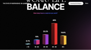
For instance, this is how a bar graph looks on the Contra Freelance Industry Report 2021 website:
When we see something like this, it doesn’t look wasteful at all. The empty space around the graph brings more focus to the eye-catching (and interactive) data.
But what would happen if we built in this amount of space around the mobile data visualization? It would likely squish the data down so much that the user would need to zoom to read it.
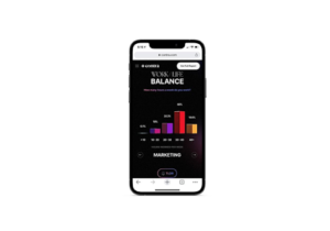
This is what that same graphic actually looks like on the mobile site:
It takes up a greater percentage of the screen compared to the desktop version, and that’s okay. As long as the data visualization has a dedicated space where it’s easy to find, and distractions are kept at bay, that’s all that matters.
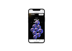
The other data visualizations on this site, including this bubble chart, are just as well-designed and with the right amount of white space:
As you can see, the graphics aren’t crowding up against the margins. Nor do the users have to scroll in order to see the graphics in full. Zooming isn’t needed.
Each mobile data visualization is designed with the perfect amount of white space to frame the graphic without compromising how easy it is to read or interact with it.
3 – Use Different Data Visualizations for Mobile Only
According to Google, the mobile and desktop versions of a site should have the same content. This makes for a consistent experience for all visitors. Plus, it ensures that all of your content gets indexed by search engines (which wouldn’t happen if some of it were only on desktop).
So, what I’m advocating for here isn’t to display different data to your mobile visitors. Instead, what you should consider doing is using a more mobile-friendly data visualization format.
Let me show you what I mean.
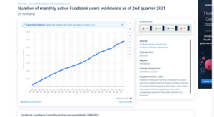
This is Statista’s data on the “Number of monthly active Facebook users worldwide as of 2nd quarter 2021”. It’s in a line graph format:
Just looking at this, you can tell that there’s going to be issues if the data were presented in the same format on mobile. So, here’s what Statista does instead:
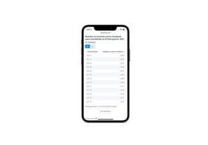
It provides mobile users with two formats with which to read this data. The first is a sortable table format:
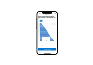
The second option is to view it as a horizontal bar graph:
It’s essentially the same graphic from the desktop, only the axes are flipped. It still tells visitors the same story, just in a more mobile-friendly vertical format.
While we could use this same bar graph on desktop, you have to think about how that might impact mobile users. A long graphic like this might require the user to scroll to see all of it.
On Statista, oftentimes, there’s a “More” button at the edge of the graphic that enables users to reveal more data. It’s not a design flaw, but I feel like choosing a better orientation or format could keep that from happening so much.
So, this is what I mean by designing data visualizations based on the device. As long as the data and narrative surrounding it remains the same from device to device, feel free to use formats that make the most sense for the available screen space.
4 – Revamp the Traditional Infographic Format
There was a time when I spent most of my workdays writing infographics and providing design input for them. This was back when responsive web design was just starting to be seriously talked about.
They more or less followed the same formula in terms of layout. The document was cut into thirds vertically and we’d slot in as many data points, quotes, or steps/tips as needed. Of course, the designer did a great job laying it out – placing a big header at the top, smaller headers to keep things organized down below, and staggering out the data. But we weren’t thinking about the mobile experience at that point.
What I find today is that infographic design hasn’t changed much. Just Google “infographic template” and you’ll see what I mean. There’s nothing wrong with using eye-catching and space-conscious formats on your desktop sites, but there’s a lot wrong with doing so on mobile.
Let me give you an example.
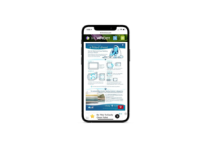
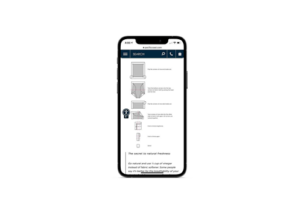
When you do a Google Image search for “how to fold a fitted sheet”, a number of infographics pop up in mobile search results. However, most of them aren’t really in mobile-suitable formats.
Here’s one such infographic on The Whoot website:
I think this infographic would look great at a bigger size and stretched out vertically. Mobile users would probably have to scroll to see all of it, but that’s okay. I don’t think anything is lost by having to consider each step one at a time. In fact, I think comprehension and focus would improve if each step had its own dedicated space.
The infographic on the Pacific Coast Bedding site is the kind of design I envision for this:
The font size could definitely be increased. There’s more than enough room to do that without having to push the graphics down with it. The vertical step-by-step layout is more mobile-friendly and should make it easier for people to learn how to fold a fitted sheet.
This might deviate from what we traditionally think of as infographic design, but I don’t think that matters in this case.
With something like an interactive map or chart, we need visualizations to be familiar so users can intuitively grab the data they need from them. Infographics have always been more like visual storyboards and fact sheets than charts. So, designing mobile infographics to look less like the traditional infographic design from the past decade can be a good thing.
It’s Time to Level Up Your Mobile Data Visualizations
Data is one of the most useful tools we have in business. However, it’s not always easy to get those facts to the users who need it most, unless you design it in an eye-catching and intuitive manner.
As more users access websites with their mobile devices, consider how your data visualizations translate to smaller screens. If they’re not getting the job done, look to the above tips to help you work out the kinks in the mobile user’s experience.

