Emojis in Web Design? Here’s What You Need to Know
When you talk to someone in person, non-verbal cues like a smile or a relaxed posture can tell you a lot about the meaning and emotion behind what they’re saying.
On websites, we don’t always have that luxury.
We do our best to build sites that appeal to the target audience, and writers do their best to convey the right tone, personality, and intent through their words. But sometimes it’s not enough.
Just as missing context or verbal cues can lead to a communication misfire in the real world, over text and email, or on social media, a website and its messaging can sometimes miss the mark, too.
While I don’t believe that emojis make sense for every brand’s style (and that’s something you’ll have to work out with your clients), I do believe they can enhance a website’s messaging when used the right way.
So, in honor of World Emoji Day, let’s look at some ways you can use emojis in web design to clarify intent, strengthen tone, and add extra personality.
Are Emojis an Effective Way of Communicating?
They can be.
Emojis can be helpful when trying to make absolutely sure the person on the other end understands what you mean – especially as it pertains to emotions.
In an interview with Forbes, 8×8’s Vik Verma explains how emojis have become useful in professional settings:
“Plain and simple, emojis help employees communicate more effectively with each other. They can indicate tone that might otherwise be misconstrued and can boost credibility. What’s really important is getting your message across as clearly as possible, and if emojis can help with that, then go right ahead.”
Emojis are also a great way to communicate more concisely and in an attention-grabbing way.
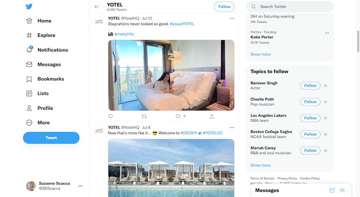
Take these tweets from @YotelHQ:
Rather than say “Photo taken by @nattylifts” in the first tweet, the camera ? emoji sums it up perfectly.
The second tweet is just as concise. The sunglasses ? emoji and poolside pic do most of the work so the copy can remain short and sweet.
Of course, emojis make sense in shorter exchanges – over text, email, and social media. But what about on websites?
Consider the Drawbacks of Emojis in Design
As we’ll see shortly, emojis can be used in web design, but you have to be careful.
For starters, emojis are often viewed as informal. So, if the brand’s personality isn’t informal, they’re going to send mixed messages to visitors.
Secondly, not every emoji is universally understood or recognizable. For example, what does this emoji mean to you?
?
I’ve never used this emoji or even considered it because, to me, it looks like a person putting their hands on their head in frustration. In reality, the emoji represents a person making a full-body “OK” gesture.
This article from Lifehack has a ton of other ambiguous emoji examples.
You also have to be very careful when using any of the smileys or people emoji.
In this 2017 study, researchers found that emoji smiles aren’t as well-received as in-person smiles are:
“Our findings provide first-time evidence that, contrary to actual smiles, smileys do not increase perceptions of warmth and actually decrease perceptions of competence. Perceptions of low competence in turn undermined information sharing.”
It’s not just the looks on the emoji faces that can rub people the wrong way. You have to consider how inclusive the selected emoji is (just like with other imagery on your site).
Where Can Emojis Go on a Website?
Emojis can be a tricky thing to master in web design. However, if they fit with the brand’s personality and you use them sparingly, they can certainly add a touch of character to your websites’ content.
Here are some of the more ideal spots for emojis on websites:
-
In the Chat Widget
This is one of the best places where you can put emojis to work.
Why is that? Well, a 2015 study looked at how people rated their text-based customer service interactions. Customer service reps who used emojis received, on average, much better scores than those that did not.
One of the researchers noted that:
“The emoticon is even more powerful than the picture, though classic research would say that the richer the modality — for instance, pictures and videos — the higher the social presence. But the fact that the emoticon came within the message and that this person is conveying some type of emotion to customers makes customers feel like the agent has an emotional presence.”
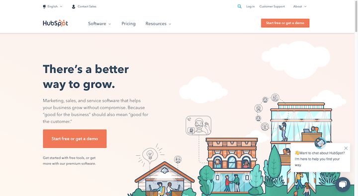
This is why I think the emoji naturally fits best within the chat widget of a website. As it does here on the HubSpot website:
The waving hand ? emoji is tiny, but it’s an effective way to grab a visitor’s attention. And it seems so harmless, like, “Hey! Over here! Do you need some help? No? Okay, that’s cool. We’re here when you need us.”
-
In the Page’s Meta Tags
Specifically, emojis work well in the title tag or meta description. While you don’t see this as often on websites as you did a few years ago, it’s still common to see on social media.
When it’s done right, a well-placed emoji can turn an otherwise bland string of metadata into something more attractive and eye-catching.
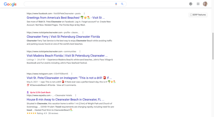
Case in point:
Of these five search results, which ones are your eyes drawn to first? It’s the ones from Facebook, Instagram, and Expedia with the emojis, right?
If you can find just one perfect emoji for your title tag or meta description, you could give a web page an instant boost of visibility in search results pages.
As a bonus, if you tag it properly, that emoji can also help the page stand out when you have a bunch of other tabs open.
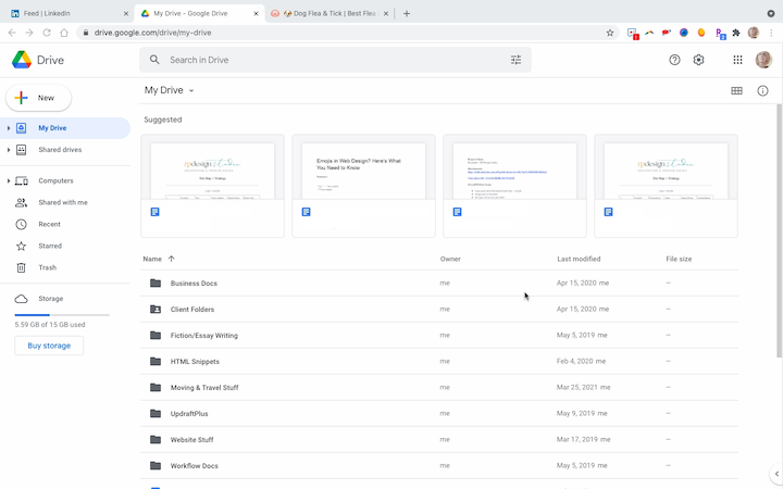
Imagine you get an email from a client when you’re in the middle of buying something online. You get caught up in Google Drive or some other work app, but then notice the cute little doggy ? emoji sitting in the open browser tab for Pet Friendly Direct:
Again, it’s a small detail, but it’s a useful tool when you’re trying to get people to focus on your website even when other distractions abound.
-
Within Your Content
Let’s be honest, most visitors won’t read all of the copy on our pages. There are certain things we can do to help draw their attention back to the page when they fall into quick-scan mode. Header tags. Images. Bolded sentences.
Why not add emojis to that list?
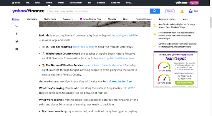
I have a few examples of websites that creatively use emojis within their content. The first is this article on the Yahoo! Finance website:
News sites can’t really replace words with emojis (unless it’s a site like Buzzfeed). However, what they can do is substitute emojis for bullet points or use them to complement bullet points, as the example above demonstrates
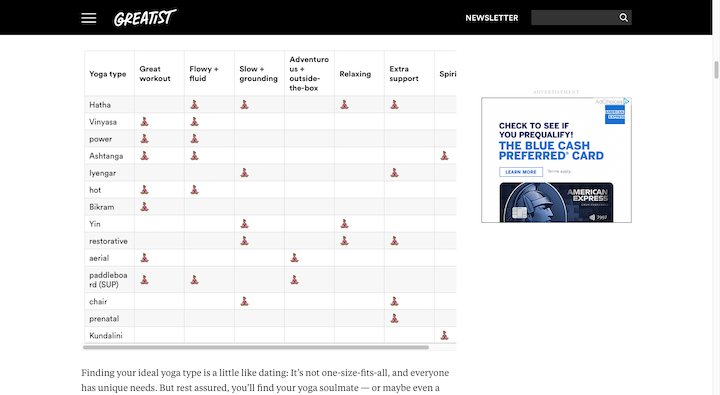
Here’s another great use of emojis to liven up the content from Greatest:
Tables are always a bit of a chore to read. This one – that breaks out the benefits and features of different types of yoga – is really neat. Instead of using a boring checkmark icon, the designer used a woman in the lotus position ??♀️.
Some other creative spots you might want to place emojis are your site’s notification bars or thank-you messages.
-
Within Your Designs
Because emojis are designed for generic communication purposes, it would look weird integrating them into your designs as is. That doesn’t mean you can’t use them. You’ll just need to take the recognizable pieces and turn them into custom-branded designs.
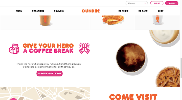
Here’s what Dunkin’ Donuts does with the folded hands ? emoji:
To bring balance to the graphic, the designer created a custom coffee cup emoji for the other side of the header.
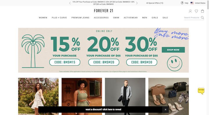
Forever 21 has also gone the illustrative route:
In this banner, we see their version of the palm tree ? and smiley ? emojis. While they’re not really necessary, they do a good job of adding more personality to a banner that would otherwise be dominated by numbers and codes.
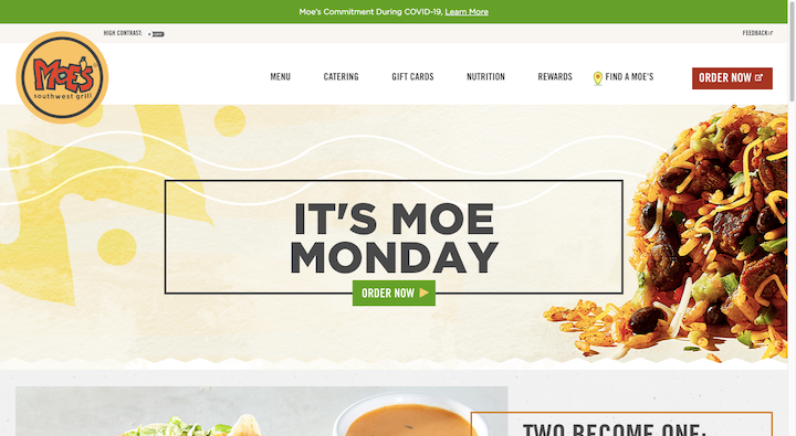
I’d also argue that this example from Moe’s is a cool example of how to use personalized emojis in your designs:
All around the site, customers encounter a variety of call-to-action buttons. And every time they do, the tortilla chip emoji is there. It’s no different than if the designer had decided to place an arrowhead icon in the CTA. It’s just that this one is much more appetizing and fun to see.
Summary
Just remember that you have to be careful when using emojis in web design. While they are known to improve some digital communications, they’re not going to work for everyone and under every circumstance. Nor can you just pick out any emoji and your audience will instantly find it charming or relatable.
But if you can find (or design) one or two emojis that work well for your client’s brand and within the context of the website, give it a try. Emojis might be small, but they can pack a big punch if they’re used in the right context.
