How NOT to Bore Website Visitors When Using a Calmer Color Palette
2020 was a rough year, to say the least. And in response to the high intensity, stress, anxiety, fear, and all the other turbulent emotions that came with it, designers are changing the color schemes around us.
Paint companies, for instance, have declared a variety of calming pastels and comfy earth tones as the colors of the year, like Behr’s Canyon Dusk:
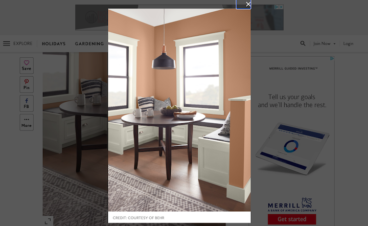
It looks like more and more of the web is headed in this direction, too.
Color plays such an important role in helping brands establish an emotional connection with website visitors and customers. But what happens when design trends suggest that you need to go calmer and gentler with color choices?
Can you still grab website visitors’ attention and inspire them to take action?
Just as interior designers might use things like furnishings, textures, and lighting to jazz up a room painted with subdued colors, there are other elements you can use to make an interface engaging.
Let’s take a look at four ways to effectively grab visitors’ attention while still providing them with a calm and safe digital environment to roam around:
1. Tell a Powerful and Convincing Story Through Imagery
Images and videos are generally great storytelling devices in web design. So, when you’re unable to make a powerful statement with a strong accent color or a large swath of in-your-face color, do it with your imagery.
One option you have is the Visit the Netherlands approach:
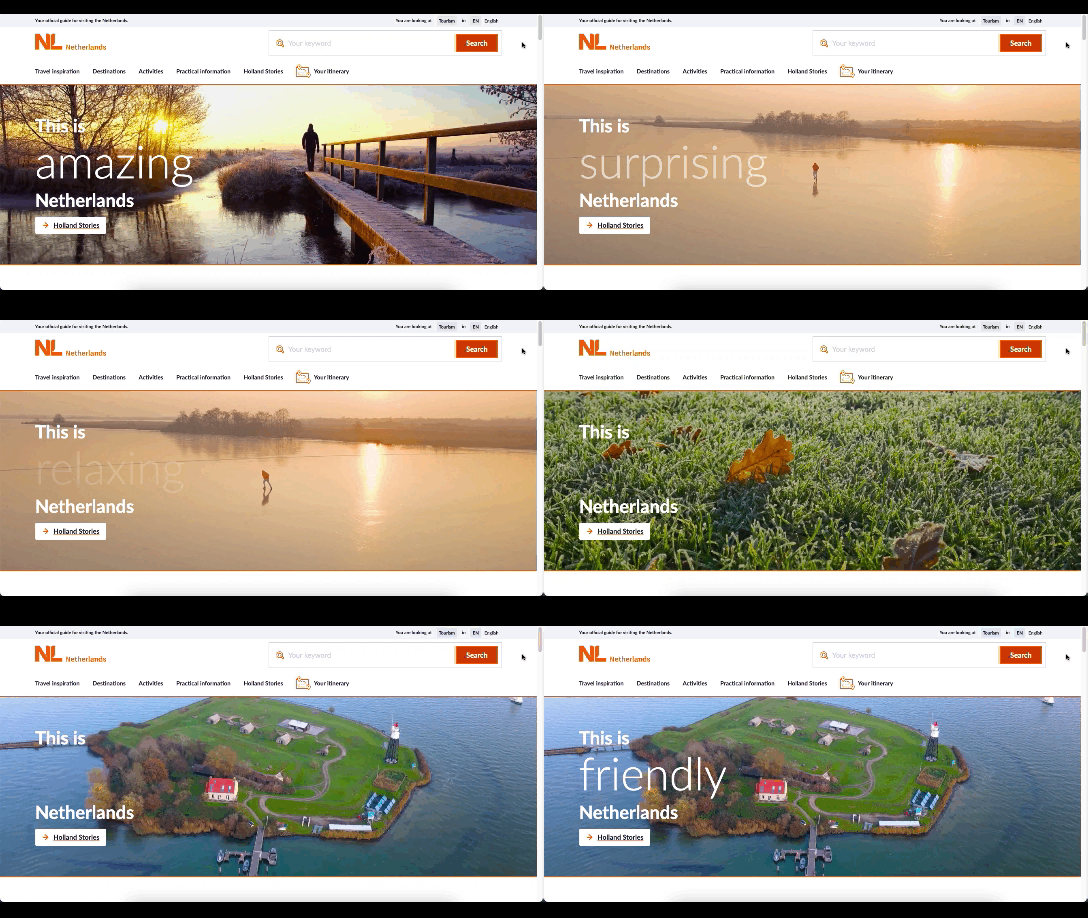
The hero banner is light on text and heavy on experiential imagery. And notice how the pacing, colors, and content of the video clips blend well with the neutral and calming design of the website.
This just goes to show you that you don’t need high-octane imagery or colors to create an engaging storytelling experience.
Another cool example of using images to captivate visitors comes from the FaulknerBrowns Architects website:
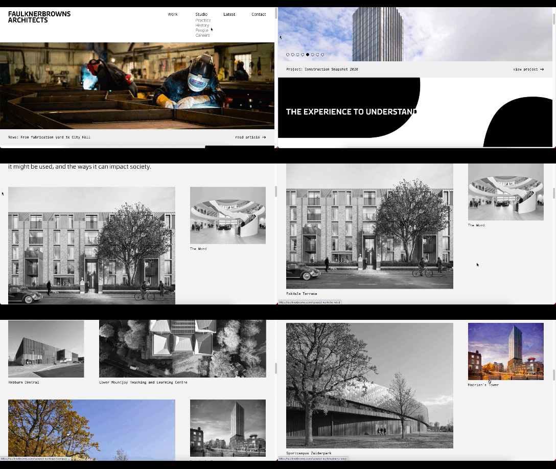
With the exception of the image carousel at the top, the rest of the site is in greyscale. That is, until a visitor hovers over one of the images – which is inevitable considering the amount of space each takes up.
It’s a sort of Wizard of Oz-like color transformation which creates an enchanting effect. It’s hard to imagine someone would visit this site and not be tempted to scroll through and see what each of these architectural feats looks like in full color.
2. Play Around with Tactility
There was a study done a few years back on the sense of touch. Participants were blindfolded and asked to haptically explore (i.e. touch) 168 objects, one at a time, for 10 seconds each.
The test demonstrated that there’s a very strong connection between touch and memory. More specifically, it found that participants were not only able to better remember items they had previously touched, but they could remember the details of them as well.
So, if you’re toning down the use of color, try adding some touch to your interfaces. It could help establish a strong connection with visitors without having to stimulate their emotions through color.
There are some really creative ways to handle the sensation of touch on the web.
One would be through your choice of imagery as Bellroy commonly does:
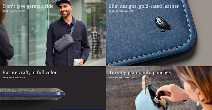
There are lots of close-ups of Bellroy’s products on the site, giving visitors more to look at than just product specs. They get to see the close-up details of the materials, each of which has a memorable touch associated with it (like the leather above).
Another cool way to make your web design more engaging would be through tactile typography, like this example from Dominique Falla:
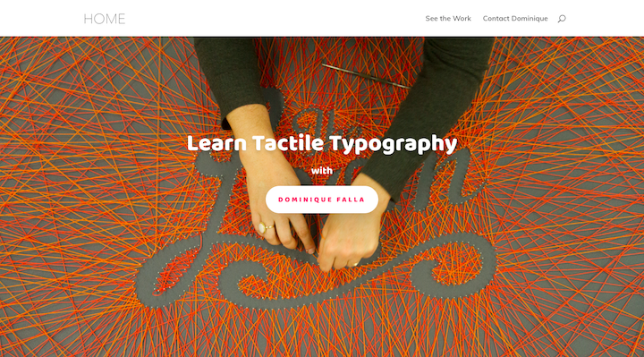
The negative space within this patchwork of string spells out the title.
Think about how cool that would look to take an item associated with the brand (like produce for a grocery store or restaurant) and to use it to shape out header text or keywords on your pages. It would require some extra work, but the effect would be really neat and memorable.
To be honest, while I’ve seen some fun examples of this on Dribbble, I haven’t found a whole lot of websites that do this. So, I guess it’s something to think about if you’re moving into calming color territory but still want a way to shake things up a bit.
3. Have Some Fun with Your Fonts
Typography might not be the kind of thing you think of when it comes to designing “visuals” for your website. And that’s definitely true when it comes to choosing fonts for your paragraph text. Readability and legibility should never be compromised.
However, there are a lot of font foundries and designers doing some cool things with typography design for titles and header text.
If the rest of your design is playing it safe in terms of color, an eye-catching font, an exaggerated font size, or even font spaces and shapes could bring some life to the page and help visitors focus on your most important messaging.
For instance, this is the Laura Mercier website:
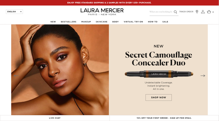
The header text in this graphic is a font called Canela Serif.
It’s a serif font, which often gives off a literary or buttoned-up vibe, but that’s not true of this one. It feels glamorous and edgy with its bold lettering and thin curves. It’s a great way to call attention to this product’s CTA without having to rely on color.
Here’s another example of a serif header font making a striking statement. This is on the Antara Studio website, which is (mostly) devoid of graphics and has a very tame color palette:
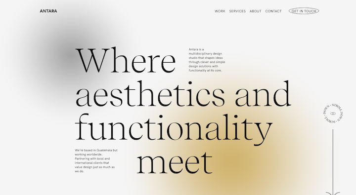
Even without the use of imagery (except on the Work page), the size and unique typography choice that makes a powerful eye-catching statement.
There are other ways to play around with fonts. See that “Scroll Down” circle on the right? This particular text shape is popping up a lot more frequently on the web these days. So, don’t be afraid to get creative with your typefaces, sizing, spacing, shapes, and so on.
4. Design Strong CTA Buttons
One of the unfortunate side effects of this calming design trend is that we’re seeing a return of the ghost button. It’s a trend I was happy to see slip away many years ago, but it appears to be back.
Here’s an example of a ghost button on the Massage Envy site:
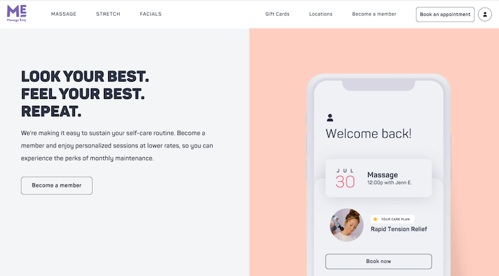
And here’s what its non-buttons look like:
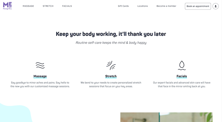
Now, these types of empty button designs are okay when giving visitors a secondary choice or an inactive option. But as the main CTA button within an already tame-looking design? It’s not a good idea.
You need your CTAs to stand out clear as day so that visitors don’t get frustrated when it takes too long to find what they’re looking for. That doesn’t mean they need to be designed with bold, bright colors. It just means finding a way to make them stand out from the surrounding content.
Massage Envy does have some regular buttons and the design looks nice:
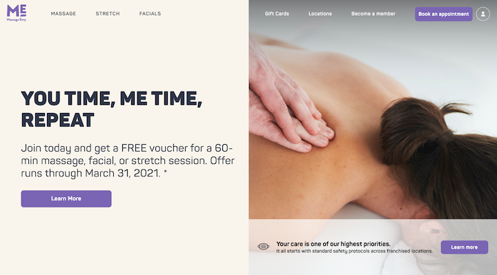
However, because they use a variety of button designs (e.g. purple filled, blue underlined, and ghost), the lack of consistency is going to create some friction for visitors.
So, I’d say for the sake of consistency, choose one filled button design that won’t completely disrupt the chill vibes of your color palette.
Something else to consider is the button design itself. If giving your button a 3D look doesn’t make sense, then consider adding an icon or animation to it to make it stand out from the surrounding content.
Wrap-Up
Thanks to this new color trend, you’ve got to think about other ways to grab the attention of visitors that will allow you to direct them to take action on your site.
With descriptive imagery, tactile design, unique typography, and strong CTAs, your websites can still make a connection with visitors even if you can’t leverage emotional color choices to do this.
And, to be honest, this might be a really good thing for the future of web design. We were heading down a path where FOMO design and dark patterns were causing some major trust issues between brands and consumers. When you remove hyper-emotional color from the equation, you can build more honest websites and have happier customers and users in the end.
