The amazing potential of variable fonts: An interview with Bianca Berning
We may be entering a typographic revolution. Variable font technology, which enables a single font file to behave like multiple fonts, is a hot topic not just among type nerds.
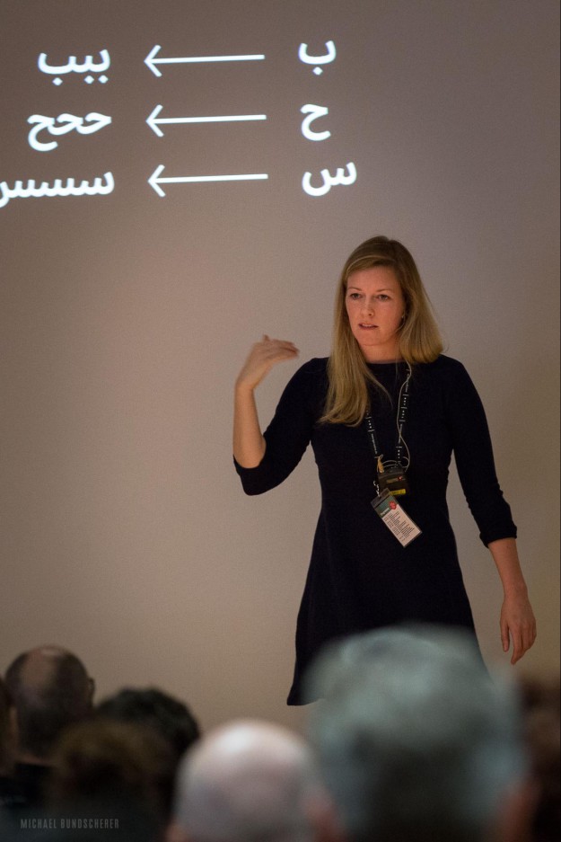
Michael Bundscherer, event-fotos.org
Font engineer and type designer Bianca Berning, creative director at font foundry Dalton Maag, sees a great potential in variable fonts for both web performance and more sophisticated, user-centred digital typography. We caught up with her to find out more about the benefits of the new technology, how its brings designers and developers closer together, and her community efforts to support the work of women in the type industry.
Why has typography on the web been neglected for so long?
As with all forms of (written) communication, the content and its message are most important. To enable website users to access this content, we need to make sure that the load time is reasonably short, or the site will be abandoned. Next to images, graphics, videos and audio, fonts (other than the standard system fonts) are just another resource that has to be loaded. Unfortunately, sophisticated typographic hierarchies often make use of a number of fonts and styles of a typeface family, which contributes negatively to the page load time. It goes without saying that when it comes to choosing between good web performance and good web typography, the latter has often gotten the short end of the stick.
Why’s everyone suddenly talking about variable fonts?
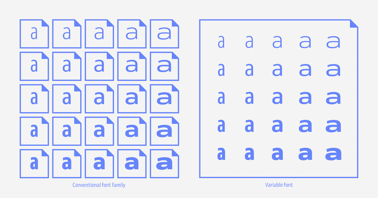
There are a number of potential benefits to variable font technology, the most obvious being that variable fonts can package and deliver all instances of a typeface family’s design space vastly more efficiently than static fonts. This results in better user experiences due to improved web performance when more than two fonts are used on a page.
By extension, the conflict between page load times and typographic finesse is often negligible when variable fonts are used. They have huge potential to transform how we are communicating on the web and elevate the reading experiences on screen.
How can variable fonts improve the reading experience (apart from loading faster) when it’s almost impossible to predict how and on what device the text will be read?
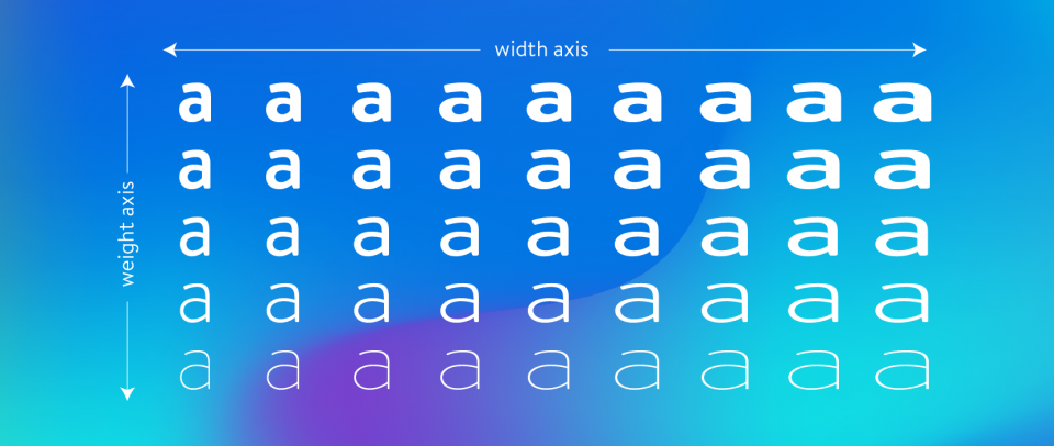
Let me take a small step back: A typeface family is a group of typefaces that are connected to each other, usually through common design characteristics. The most common parameters that link typefaces within a family are weight and width, but there are also possibilities to compensate for varying output conditions, like size-specific optical adjustments. In metal type, size-specific designs were meant to compensate for a number of factors that could affect the printing, like quality of paper, amount of ink, pressure, and degradation of the metal letters over time.
When we talk about reading on screen, we might want to consider a different set of variables like pixel density, screen orientation or average viewing distance. Variable fonts with an axis for optical compensation could help improve how the text is being rendered by choosing the most suitable instance of the typeface for any given situation. I can imagine that text might respond not only to the output device but also to the environment the reader is in, the reader’s preferences, their constitution, age or eyesight.
What are your favourite uses of variable fonts in the wild?
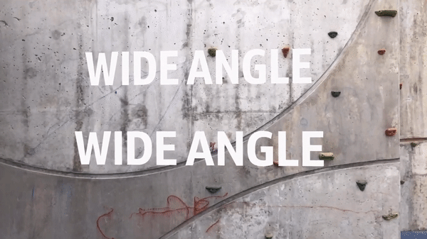
I genuinely admire Andrew Johnson’s experiments with variable fonts and viewing angles and distances in AR. It shows a level of responsiveness that would have been very hard to achieve without variable font technology and makes me wonder if we will see type and typography develop alongside new technologies in ways we don’t even dream of yet.
Not a font-in-use in itself but Wenting Zhang also recently launched the Font Playground which is super helpful to explore a variable font’s design space.
I’m generally really pleased how variable fonts seem to excite designers and developers alike. It certainly got them to talk to each other and made them collaborate more closely. Variable font technology is still very much in its infancy, browser support is still a hit-and-miss and users don’t have a huge variety of variable fonts to choose from yet. We are all still learning, and that process can be equally as maddening as it is invigorating.
Finally, who are the Alphabettes, what do they do and how can people get involved?
Alphabettes is a network to support and promote the work of women in the type industry and related fields. Most outreach happens through alphabettes.org, which is a showcase for work, commentary, and research on lettering, typography, and type design. Its header is being designed by a different woman every other week and not only shows design diversity but also the cultural diversity behind the initiative very well. New voices are always welcome. If you are a woman and you design typefaces or do lettering, you can contribute a header or an article or just send us a question.
On that note, we’re also running a mentorship program with the aim to help people, especially students and professional newcomers, to immerse themselves in the industry
Venn is a variable font with a design space that ranges from Light Condensed to ExtraBold Extended, available for free for both commercial and non-commercial use until 1 March 2019 at daltonmaag.com
Click here to build your next great project on Media Temple.