Rebooting the Web Experience With Motion UI
We can’t talk about Motion UI without talking about its ancestor, Flash. The build-up had been coming for 8 long years and then, just like that, on the 12th January 2021 Adobe finally killed Flash. For good.
Across the globe, legions of old-school creatives who lived through the epic rise of Flash in the early 2000’s let out an emotional sigh. Damn those Flash security risks.
The irony is that Flash was the original – and at the time ultimate – enabler for cinematic-quality motion and animation on the web. Designing in Flash meant the shackles had come off amongst the design community, creativity was allowed to flourish unimpeded, eye-candy was rife across the web and branded Flash “splash pages” were ubiquitous.
In reality, the death of Flash had been a slow and painful experience – with Steve Jobs putting the first nail in the coffin back in 2007 when the iPhone was released with no support for Flash. Since that time, Adobe had been quietly dialling-down life support for the plugin, whilst the broader web design community – aware of what was coming – gradually transitioned over to using HTML5.
Over the next decade, motion design and animation matured and became more grown-up; designers moved on from the party days of bandwidth-killing (often meaningless) transitions and animations to today – where it’s generally accepted that motion design should be used with restraint and, ultimately, provide functional utility to end users.
What is Motion UI?
Motion UI is the art of leveraging movement and animating within an interface to help guide the user experience and communicate a sequence, next step, transition or action for a digital product. Motion is also used extensively as a branding tool, reinforcing visual cues and interactions which we might associate with a particular brand.
As humans, our brains are hard-wired to respond to movement. It’s part of our fight-or-flight response and the reason why over 40% of all the nerve fibres connected to the brain are linked to the retina. It’s super-useful when we’re using our peripheral vision to discern danger and protect ourselves. It’s super-annoying when our eyes are attracted to pointless movement and animation on a website which only serves to degrade the functional user experience.
Motion UI Today
From the beginnings of motion on the web with the use of the <marquee> tag (to scroll text sideways) to today’s cinematic-quality Motion UI frameworks used by everyday web designers, motion has become one of the most important tools for delivering engagement and interaction across the web.
These days, the majority of web interface motion is controlled through the browser, leveraging CSS, HTML5 and JavaScript Frameworks. This negates the need for 3rd-party plugins or video players to display motion and animation.
As the online battle between platforms and brands rages on in the fight for our attention, the need to leverage motion and animation to cut through the noise of the web has never been more critical. When used with restraint, Motion UI is a powerful enabler of beautiful user experiences and can transform a flat, static interaction to a memorable moment of deep engagement with a brand.
Many pioneering brands obsessed with great user experience have released their own design guidelines with standards and best practices around motion, including Google’s Material Design, Apple’s Human Interface Guidelines and the incredibly motion-centric Lottie framework from AirBNB. These guidelines look to synthesize classic principles of good design with the innovation and possibility of technology and science. It’s ultimately about the provision of a unified experience across platforms and devices.
Storytelling through Motion
Motion can be used to tell a story and invoke emotion. Storytelling is a powerful way to drive engagement online, but at its heart, a story is simply a sequence of events. As digital experts we strive to deliver the most intuitive stories to website users and motion is the perfect guide. Storytelling with motion and animation can create exceptionally aesthetically-pleasing moments but also reinforce incredibly functional user experiences.
Motion UI can play a vital role in how a user engages with a digital platform; our eyes follow motion and we instinctively look for visual clues and narratives to follow. We also know that motion is much more memorable for visitors than static images, so we can use it for not only simple visual elements such as text and shapes, but also to take people on a journey, engaging their visual sensory receptors with motion sequences to better communicate more memorable ideas.
Microinteractions through Motion
Microinteractions are those subtle, specific moments of interaction with a user interface which bridge the experience to the next-best-step a user should take. This might mean tapping on a hamburger menu icon which pulls down a navigation, swiping left or right or toggling a control on or off. Motion makes these interactions feel more organic and less abrupt.
“Microinteractions are an exercise in restraint, in doing as much as possible with as little as possible. Embrace the constraints and focus your attention on doing one thing well.” (Dan Saffer, author of Microinteractions)
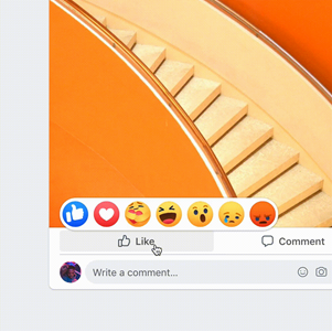
When implemented correctly, microinteractions enabled by motion and animation are barely noticeable for a user – until the moment when a user faces the problem of their absence. Other examples of microinteractions include animated buttons, switches, system status animations, load indicators and other notifications.
Microinteractions help boost the overall usability of a product. They inform users that tasks have been successfully completed; buttons have been pushed, the toggles have been moved or the required form fields have been filled-out.
Creating Anticipation with Motion
Anticipatory design means creating an interface which responds to user needs one-step before they actually express those needs. Motion UI is an excellent tool to inform users and highlight relationships between elements, action availability, and action outcomes.
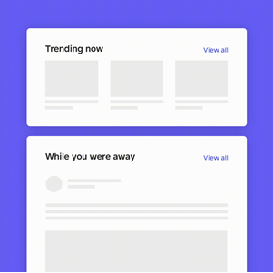
Motion helps guide visitors across the website or app experience, with movement and animations intuitively communicating where to focus, what to do next and what the most important elements are on a page.
Motion builds an understanding about the flow between two elements and can be used for hierarchy and connection between navigation, element transitions, function change and other effects. Motion is used to hold attention waiting for a page to load, creating the illusion of speed, making users more likely to wait patiently for page content to display.
Bringing Data to life through Motion
For most of us, data (in its purest form of zeros and ones) is visually uninspiring. Our brains don’t instinctively apply effort in trying to process complex tables and numbers when first presented to us on a screen. For most people, it’s hard to get excited about tabular data on a screen.
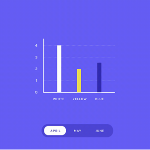
Enter Motion UI. Visualising data with motion provides both aesthetic satisfaction and interpretive usability, essentially bringing data to life. Data can be represented by shapes, colours and gradients, breathing vibrancy into tabular layouts through rich data visualisations and dynamic movement.
Brand Recognition
One of the most effective uses of Motion UI is to reinforce brand recognition. Many pioneering brands use Motion UI to add a layer of recognition and depth to their interfaces, invoking instinctive brand recall and generating a much higher emotional response than would be achieved through static imagery. Motion design ensures that digital interactions stay true to a brand and resonate with the consumer. It’s essentially a way to convey a coherent brand narrative for consumers through a consistent user experience.
In Summary
So, does this more contemporary focus on utility and functionality mean that the glory days of using motion to create epic eye candy and impactful visual experiences on the web are over – or are there still opportunities to leverage Motion UI to surprise and delight visitors, without diminishing the user experience through gimmicky distractions?
The answer is that motion is absolutely critical to the web experience of the future and should be used by designers to breathe life into the static and monotonous world of web design. Once basic user needs have been met and a digital product works as expected (or better), motion is the ultimate amplifier and enabler of a positive, long-term relationship which a brand can have with a customer.


