
What Makes Consumers Love Some Retro Logos and Not Others?
Calling something “dated” is usually a bad thing. Like you’d probably be a little hurt if someone called your hairstyle or sofa dated.
But what makes one thing dated and another retro? Or vintage? Or nostalgic? Aren’t they all just interchangeable terms for old-fashioned?
Considering the recent surge in logo redesigns from very recognizable companies, I think this is an important question to examine. In essence, where is the line between outdated and nostalgic? Because while one brand’s nostalgic logo might be received with open arms by the public, your attempt at designing a retro logo for a client could be poorly received and seen as “dated”.
What I want to do today is look through a number of high-profile rebrands and analyze what makes their retro logo designs look dated, nostalgic, or a total misfire as well as why the reviews aren’t always positive for retro designs.
Burger King Gets Funky With It
Burger King has been around a long time, so it came as a shock to a lot of people when it rebranded in 2021.
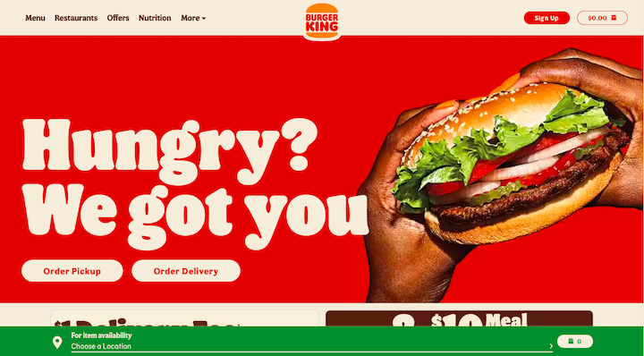
Burger King’s branding team explained the reason for the retro redesign as such:
“We wanted to use design to close the gap between the negative perceptions people have of fast food and the positive reality of our food story by making the brand feel less synthetic, artificial, and cheap, and more real, crave-able, and tasty.”
Here’s what the branding looked like previously:
![]()
Aesthetics-wise, there’s very little argument about the quality of the design. Customers think the psychedelic designs and funky serif font are a fun change of pace. In terms of it being dated vs. retro, this one is 100% retro. The design is the perfectly modern riff on Burger King’s old logo design.
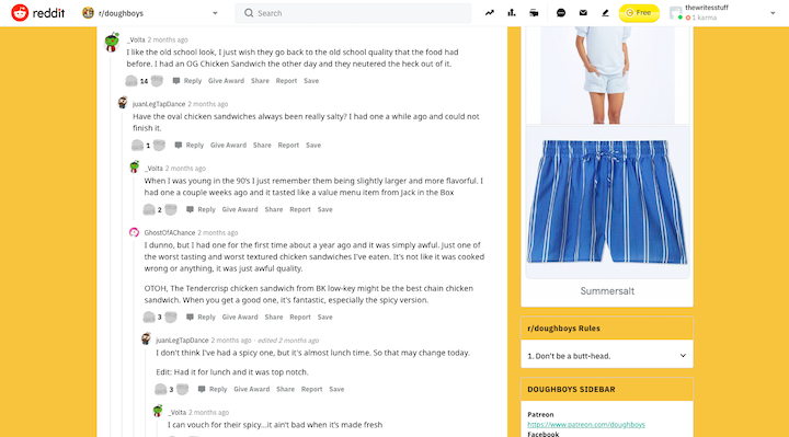
There’s just one problem though: Aside from changing its uniforms, merchandise, online branding, packaging, and signage, Burger King hasn’t changed its product, as some customers have pointed out, like these ones on Reddit:
So, it’s important to be careful with a retro rebrand.
If your whole mission statement is around removing negative perceptions of the product, your product should be part of the rebrand if you want customers to get onboard with the change. Otherwise, a showy rebrand could end up just bringing more attention to a flawed product.
Verdict: Retro… but perhaps not the example you want to follow.
Kodak Comes Back to Life
Kodak used to be a giant in the photography space. Similar to the Blockbuster story, however, Kodak failed to keep pace with the digitization of photos and had to file for bankruptcy in 2012.
Soon after, it returned with a new product line – including a 360-degree camera, the IM5 smartphone, and a digital/analogue Super 8 camera – and new branding.
This is what the Kodak website looks like today:
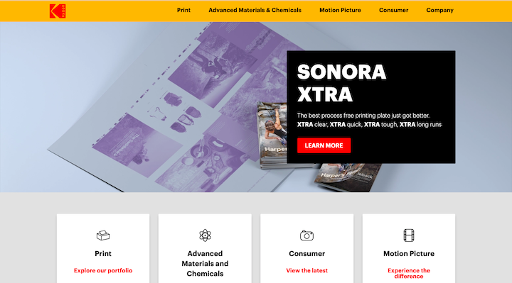
foerstel shows us how this new logo design harkens back to Kodak’s heyday from the ‘70s to the ‘90s:
![]()
While the new design is more attractive than the lettermark from 2006, I’m not sure it had the intended effect.
Nostalgic design is effective when it brings people back to a positive time, place, or memory. However, digital cameras and smartphones allow everyone to take and share photos in real time, edit them like a pro, and do so for free. So, how many people are longingly looking back to when they’d have to wait a week or so to see if their friends or family blinked their eyes or made funny faces in their photos?
While the brand has made some right moves with rebuilding its product line in recent years, I don’t know if the logo redesign tells the right story.
Verdict: Aesthetically retro, but dated in message.
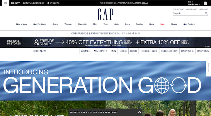
Gap Mistakes “Old” for “Dated”
In 2010, Gap’s sales were waning. Leadership decided that branding was the problem and so the company made the switch from the classic 25-year-old logo to this:
![]()
Gap made a huge mistake in thinking that an old logo was the reason for poor sales. Backlash was immediate as customers flooded the internet with complaints.
I’d argue that the response to the backlash made things even worse as it showed how noncommittal Gap was to the rebrand:
“Thanks for everyone’s input on the new logo! We’ve had the same logo for 20+ years, and this is just one of the things we’re changing. We know this logo created a lot of buzz and we’re thrilled to see passionate debates unfolding! So much so we’re asking you to share your designs. We love our version, but we’d like to see other ideas. Stay tuned for details in the next few days on this crowd sourcing project.”
Gap eventually reverted back to its old (and definitely not dated, by its customers’ standards) logo. And it’s the one the company still uses to this day:
As Stuart Watson explains in this article on Fast Company:
“It’s not really about the design of the logo. It never was. It’s always been about what a logo represents. Logos are a shortcut to memories. Take away the logo, and you remove the connection to all of those moments you associate with that brand.”
The customer response to Gap’s redesign is proof of this, too. Otherwise, there wouldn’t have been such a big uproar. When companies make decisions that sever those long-standing emotional connections that customers have with their brands, they stand to lose everything they’ve worked for.
Verdict: An unnecessary modernization of a much-loved retro classic.
Warner Brothers Gives Its Logo a Pre-anniversary Facelift
In preparation of its 100th anniversary in 2023, Warner Brothers redesigned its logo. The last redesign was in 1984, so it makes sense why the company was considering shaking things up for the big day.
However, this is how poorly the redesign was received, according to a survey done by Visual Objects:
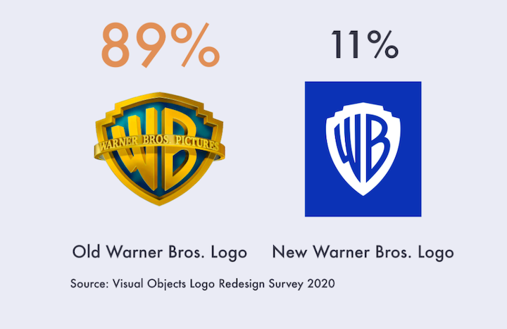
While skeuomorphism has definitely fallen out of fashion, it seems that nostalgia and brand identity are much more powerful forces than modern design tastes.
What I think is particularly interesting about this logo redesign is that people are hating on it because it appears that it’s just jumping on the flat design bandwagon. There are two things to note about this.
The first is that Pentagram, the agency behind the redesign, actually created a skeuomorphic version of the blue-and-white shield for the studio’s water tower:
![]()
So, this isn’t just some flat design reboot of a much-loved logo. What’s more, the new logo is almost identical to the 1929 version:
![]()
The shield is more defined in the older one and the colors aren’t as Facebook-y as the 2019 rebrand, but they’re otherwise the same design.
So, I almost wonder if this is a case of going too far back, to the point where barely anyone is alive who remembers the earlier design to feel nostalgic about it.
Verdict: Ultra-modern and dated.
What We Can Learn from Recent Logo Redesigns
Okay, so let’s go back to the original question: Is there any difference between a logo design/redesign that’s viewed as dated vs. retro vs. just a really poor decision?
I think it depends on a few things:
Intent has a lot to do with it. Just look at some of these companies doing redesigns for the sake of redesigns. Without some meaningful driver behind it, customers are more likely to view it as a shallow attempt to get people talking about them.
There’s also the issue of product misalignment. When a logo is redesigned simply to play on customers’ nostalgia, you have to consider what sort of memories about your offering that nostalgia will dredge up. They might not be positive ones.
The era being thrown back to also matters. It’s definitely possibly to go too far back in time, or even to an unpopular time, and have the retro design backfire on you. As the majority of consumers grow younger each year, this is something to think carefully about.
Honestly, I think this is a good argument for user research, surveys, and testing before launching any new project or rebrand. This is especially so for older companies who’ve built up a ton of good will with their customer base. Even if you’re moving the brand into more modern design territory, or giving a brand a “fun” retro throwback, customers might not see it that way.