How Science Fiction Influences Design Innovation
Science fiction is littered with bold ideas that never come about in the real world: jetpacks, hoverboards, flying cars, flying cities, all kinds of flying things really.
But there have also been notable hits, particularly in the area of interface design. And the very best of these have pushed real-world design forward, transforming how we interact with the world.
What magic fueled these visions of the future? Why do some inspire while others fall flat? Let’s explore a few of the most prescient, influential examples.
Four Influential Visions of Futuristic Interfaces
Star Trek – How the Far Future Became Today’s Design Standards
Gene Roddenberry’s concept of a distant future pushed countless visionary technologies into the public consciousness. And while teleportation and warp speed haven’t quite become reality, a lot of Star Trek’s speculative tech has.
Thin displays, touchscreen controls, minimalist UI, voice assistance, pocket devices with access to all the world’s information … Before the brand of a quarter-munched apple, those things bore the mark of an interstellar arrowhead.
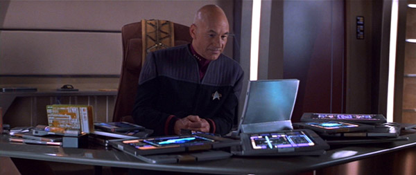
Star Trek’s Personal Access Display Devices (or PADDs) might be the most literal manifestation of sci-fi technology in the real world. What was depicted as technology over 250 years into our future came to fruition in the iPad, under 25 years from the first air date of The Next Generation’s remarkably similar PADD.
That we turned the future into today so quickly is both a testament to the product designers behind the actual technology as well as the production design team building Star Trek’s vision of what the future could be.
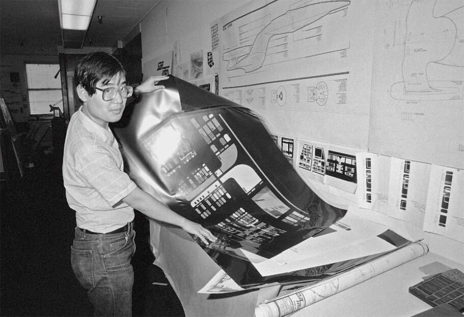
When it comes to the interface displays on these devices, Michael Okuda gets a lot of credit. (The displays even bear his name: “okudagrams.”) Talking to Ars Technica, Okuda explained the philosophy behind the Star Trek team’s approach:
“[Gene] Roddenberry had the wisdom to realize that ‘advanced’ didn’t mean ‘more complicated.’ He actually wanted things to be much simpler. So we took that to mean it was cleaner, better user interfaces, fewer buttons, fewer things to learn how to operate.”
Star Trek’s futurists looked forward, in part, by paring back.
And that’s a big part of why Starfleet’s designs have commanded so much influence.
Minority Report – How Flashy Interaction Became the Next Big Thing
On the flipside: If there’s a poster child for breathtakingly complicated fictional interfaces, it’s Minority Report.
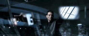
Citizens of this Philip K. Dick-inspired dystopia interact with giant transparent screens using special gloves and hand gestures. Spinning controls, sliding view frames, and pinch-zooming imagery enamored designer audiences when the film debuted in 2003. And it’s hard to go very long in a conversation about new technology without someone saying, “It’s just like Minority Report.”
The film has heavily influenced designers creating real-world applications as well as those making cinematic futures even more futuristic. Much of the Marvel Cinematic Universe’s interface design harkens back to the concepts depicted in Minority Report.
Things have definitely advanced. In the decades since Minority Report swiped its way into the interface conversation, we witness more holographic depth in our sci-fi displays, and users don’t need special gloves to interact with them. But the hand-waving, body-moving, jaw-dropping concepts remain the same.
The complexity of Minority Report’s interactive experiences acts satirically at times, too. When hero John Anderton gauntlets through biometrically personalized advertisements, we’re not meant to yearn for the noisy excess of 2054. Of course, these ads were also actual paid product placements in the film. And plenty of marketers dream of this kind of pinpoint personalized precision.
Even the embrace of this cynical side speaks to a spark of approachability within the shock-and-awe. Despite its flashy stacks of layered subscreens, the gesture-based and biometric interactions feel direct and intriguing. Minority Report’s tech added its complex new layers by streamlining the base mode of interaction first – with users directly manipulating displays as if they were physical objects.
Through the clutter, we can imagine ourselves in this future.
Of course, there’s another reason why that future became so influential: It was taking its own influence from ideas already in motion.
In designing the experiences, the film’s production designer Andy McDowell has often cited his team’s access to experimental technologies actually in the works at large corporations at the time. The advertising scene? Inspired by Amazon’s big-data personalization. Here’s McDowell in an interview with Den of Geek, “It was really important that we could say, to the best of our knowledge, this is a pretty fair guess at what will happen. More than a guess. A well informed decision based on research that just having Spielberg at the helm gave us access to.”
A secret behind designing an amazing futuristic interface? Utilize concepts already being explored. It’s not so much about creating an entirely new concept as it is interpreting a new concept in a way that an audience can understand it.
Her – How Visionary Design Got a New Voice
Where Minority Report and its offspring focused on simulating a tactile interactive experience, Her explored a soundscape.
2013’s Her imagines a world where voice assistants – and more specifically, AI-driven voice assistants – become a dominant form of digital interaction. This frees up the world’s flashy experiences to look more like this:
Interviewed by Wired about his role in the film’s production design, KK Barrett said, “You could say that Her is, in fact, a counterpoint to that prevailing vision of the future – the anti-Minority Report. Imagining its world wasn’t about heaping new technology on society as we know it today. It was looking at those places where technology could fade into the background, integrate more seamlessly.”
Despite taking a radically different perspective on how its interfaces are designed and experienced, Her still adheres to the big ideas that made other designs we’ve looked at feel so engagingly forward:
- Simplify the core interaction
- Interpret existing experimentation
In Media Temple’s recent panel on 2021’s Web Design Trends, Andrezza Valentin – Global Creative Director at MediaMonks – pointed to voice and AI interaction as being a continued emphasis in innovative design concepts. 8 years after the release of Her, its vision of the future of interfaces has stuck with creators seeking to make it reality.
We’re not there yet, and the dream hasn’t materialized as quickly as some have predicted. But Her took the possibilities of what we were already toying with and presented it in an empathetic story form. It feels simultaneously unfamiliar and understandable, alien and common.
Black Mirror – How the Future Ended Up Reflecting Today
Like all the examples so far, Black Mirror exists as both a vision into the future and a reflection of the present. It also presents enticingly futuristic designs that are intensely closer to our current experience than the rest.
Gemma Kingsley, motion graphics designer for many of the series’ signature episodes, put it this way in conversation with Pushing Pixels, “As a viewer you look at it, and you notice that it’s different from what we use currently. We are not as advanced as that technology, but you can relate to it.”
She also shared this anecdote about someone overly convinced by its verisimilitude:
“I was contacted by a chap via email, and he asked me where he could find the taxi that we designed for The Entire History of You. I designed all the graphics for the taxi, and he wanted to know where to find that, because he liked it and he wanted to use those. He didn’t realize that it was completely fake. The graphics were minimal, but still very advanced, and he thought it was a technology that he could buy and use.”
There’s something new and striking about a well-executed fictional interface. More importantly, there’s a sense that if you were to have that thing with you right now, you would know exactly how to use it. You recognize the unique improvement it provides, and the practical application of it.
The Limits of Looking Toward Fictional Design
When it comes down to it, fictional interface designs only exist to fill a particular need in a narrative.
They don’t have to be real.
So to some degree, both the simplification and the advancement exist as illusions.
Kingsley touched on this while discussing Black Mirror’s “White Christmas” episode and its table-sized interface display, “No matter where she pressed on that table, it would be exactly what she needed to press.”
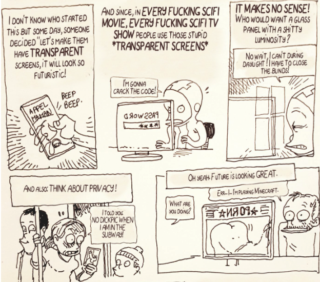
Reflecting on French cartoonist Boulet’s comic rant about transparent screens in science fiction, Christopher Noessel wrote this, “The cause-and-effect is scripted. It could be the most unusable piece of junk tech in that universe and it will still do exactly what it is supposed to do. Sci-fi interfaces answer to the masters of story, worldbuilding, and often, spectacle.”
(Noessel’s Sci-Fi Interfaces blog is one of the best sources for analysis on fictional user interfaces, and he wrote a book on the topic, too.)
But it’s worth noting that some production design teams do think about wider use cases in their designs. Discussing the expansive scope of design work in Minority Report, McDowell wrote in the Journal of Future Studies, “In this case, the design of the world preceded the telling of the story. The world had become a container for narrative – not just one narrative, we could have told hundreds of stories in this space.”
Finding Inspiration in Fictional Futures
Given the common traits of influential futuristic interfaces, these limitations shouldn’t discourage us from considering cinematic representations in more practical work – even if we approach them carefully.
For one, fictional interfaces provide a model for what a new concept could look like. And they help build a common reference point for discussing these concepts. We can more easily discuss the challenges and opportunities of design concepts if we have phrases like “it’s just like Minority Report” in our vocabulary.
At their root, these fantastical depictions take an abstract concept and put them in an accessible context. They imagine practical applications and place innovative designs into a lived-in world.
In the same way we might use a persona to consider interaction with a prototype, a cinematic depiction of a futuristic interface simulates one user’s journey with a conceptual technology.
Yes, the experience seen on screen is just one experience – only one story among a myriad of actual possibilities.
If that experience resonates strongly, though, there’s a good chance that it can resonate across a wider set of scenarios.
A source of inspiration will never be a fully packaged, perfectly formatted template ready for mass production. But that’s where our design work comes into play.