What’s Wrong with UX: An Interview with Laura Klein
Laura Klein has worked in user experience (UX) for more than 20 years, written two books (Build Better Products and UX for Lean Startups, and as the principal of Users Know advises early stage startups and consults with companies that want to improve their research, UX, and product development processes.
She also co-hosts two popular podcasts: in What’s Wrong with UX (73 episodes and counting) Laura and UX designer Kate Rutter have a drink and fight about how to make products suck slightly less, while in Engsplaining she discusses how to make engineering and product management work better together with engineer Lisa Dusseault.
We caught up with Laura to talk about the main mistakes companies make and how to solve them, her favorite tools for product teams, what designers need to know about product management, and more.
What are some of the main mistakes companies make with UX?
One big mistake I see repeatedly is companies thinking that user experience is something that you add late in the development process. I call this “sprinkling some UX on it.” This tends to come from companies who equate UX with visual design, and they think that designers should come in at the very end and make a few tweaks to fonts or colors. UX designers and researchers should be involved from the very beginning of a product or feature. Good UX design practices can help you understand your users’ needs more clearly and develop products that meet those needs in an easy and intuitive way.
A related mistake is simply not understanding that there are all sorts of different types of designers. Frequently, companies hire visual designers when they need information architects. Or they hire interface designers when they need service designers. It would be fantastic if we could all do everything, but it’s an unrealistic expectation. You wouldn’t go to a podiatrist if you needed a cardiologist. Don’t make the same mistake with designers.
How can we solve these mistakes?
If you want to get the right sort of designer, you need to take a good look at what roles are missing from your team. Do you need somebody to help you explore the needs and goals of your users? Do you need someone who can translate needs and goals into potential solutions? Do you need someone who can take a giant mess of an overbuilt product and dramatically simplify it? Do you need someone who can come up with a simple visual or gestural system to use across multiple interfaces? What are your goals as a product team or company? Once you’ve figured that out, interview for those skills. Don’t just pick people with pretty pictures on design portfolios.
Once you have the right designers and researchers, include them very early in the process for figuring out what to build next. If you’ve chosen well, they should have tools to help you understand your users and to find features that solve real problems.
How did you and Kate Rutter come up with the idea for “What’s Wrong with UX”?
Kate and I taught a UX class together a few years ago. After class, we’d often grab a drink with some students and argue about design. They always said that’s when they learned the most, and that they’d miss hearing us fight after a few glasses of wine. We decided we’d miss it too, so we decided to keep occasionally having a drink and arguing about stuff, and we promised we’d record it. I, personally, never thought we’d have more than a few dozen listeners, most of whom would be our ex-students. The name, of course, is because most of our conversations end by one of us shouting “WHAT IS WRONG WITH YOU?” at the other one.

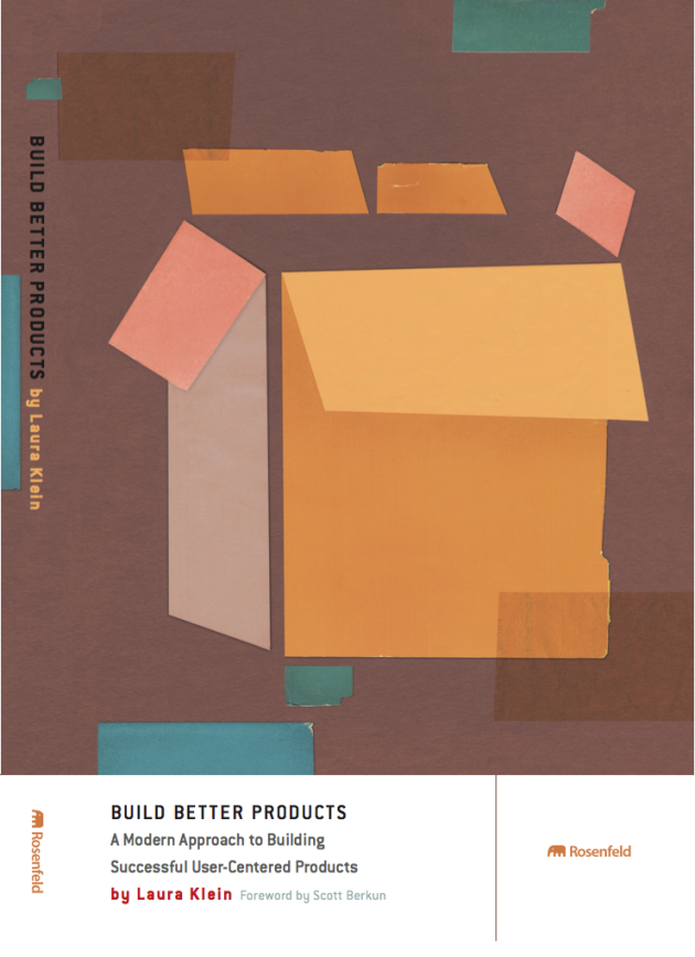
Laura Klein’s book Build Better Products teaches teams how to incorporate strategy, empathy, design, and analytics into their development process.
What’s right with UX? Which brands really get UX, and what can we learn from them?
I don’t really pay attention to brands. There are a few products that I think work really well to solve problems I personally have. I’m a big fan of LaunchDarkly. It’s specifically designed for product teams to add something called feature flags to their products really easily. I’m currently in charge of a few products, and it lets me control what features different users see with the flip of a switch. It’s completely seamless, and it took the engineers about five minutes to add it to our engineering environment.
I also like Mural.co a lot. I work on an entirely remote team, and I miss being able to quickly whiteboard things. Mural is a virtual whiteboarding system that lets us throw things together quickly for discussion and sharing. It also just works. In some ways, it’s even better than real whiteboards, since I can have an infinite number of them.
What skills should new designers, who are coming into the industry, focus on?
I don’t know that the fundamentals have changed much. Designers still need to understand how to get user insights and how to translate those into usable product designs. They should also have an understanding of how to validate their ideas, so they’re not just designing pretty pictures that nobody can use. The tools change a lot, and of course what you need to know is heavily influenced by how your team works.
I also think it’s critical that designers understand enough about the technology they’re working with to have a good discussion with the engineers implementing the designs. I’m not saying that everybody needs to know how to code (although I’m certainly not opposed to it), but try not to be completely technologically incompetent. It’s much easier for everybody if you understand enough about the technology to not design something that’s impossible to build.
What do designers need to know about product management?
At the highest levels, design and product management become very similar, honestly. Sure, PMs are often in charge of some of the details like writing up engineering stories or managing the backlog or tracking analytics, but there are lots of teams where designers do some or all of those tasks. It can depend on the size of the team and what you’re working on.
Although, I should point out that no new designer is going to understand all of the things I just said they should learn. I get that. People are going to tell designers a million variations of “oh, you should learn to code” or “you MUST learn to write compelling copy” or “you have to understand testing and experimentation.” All of those things are great, and they’ll make you better at designing things. So will sketching, interviewing, visual design, and a thousand other things. Nobody’s got time to learn all of those things. I’ve been in tech for over 20 years, and there are still huge swaths of things I don’t know or can’t do well. It’s ok. You don’t have to do it all right now. Get good at a few things that you love and that people will pay you to do, and stay curious and interested in other parts of the industry.
What’s your favorite user research technique?
It’s whatever will help me learn what I need to know at the moment. That might be a contextual inquiry or a diary study or a wizard of oz experiment or a task based usability test.
What’s been your favourite drink pairing on “What’s wrong with UX” and why?
I think the most honest pairing was “anything with bitters”, which could probably pair well with about half the episodes.
Click here to build your next great project on Media Temple.


